Articles from Data

  • The Loneliest Star in the Sky

    sky images and a distribution plot

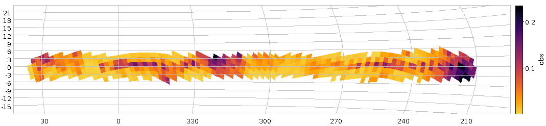
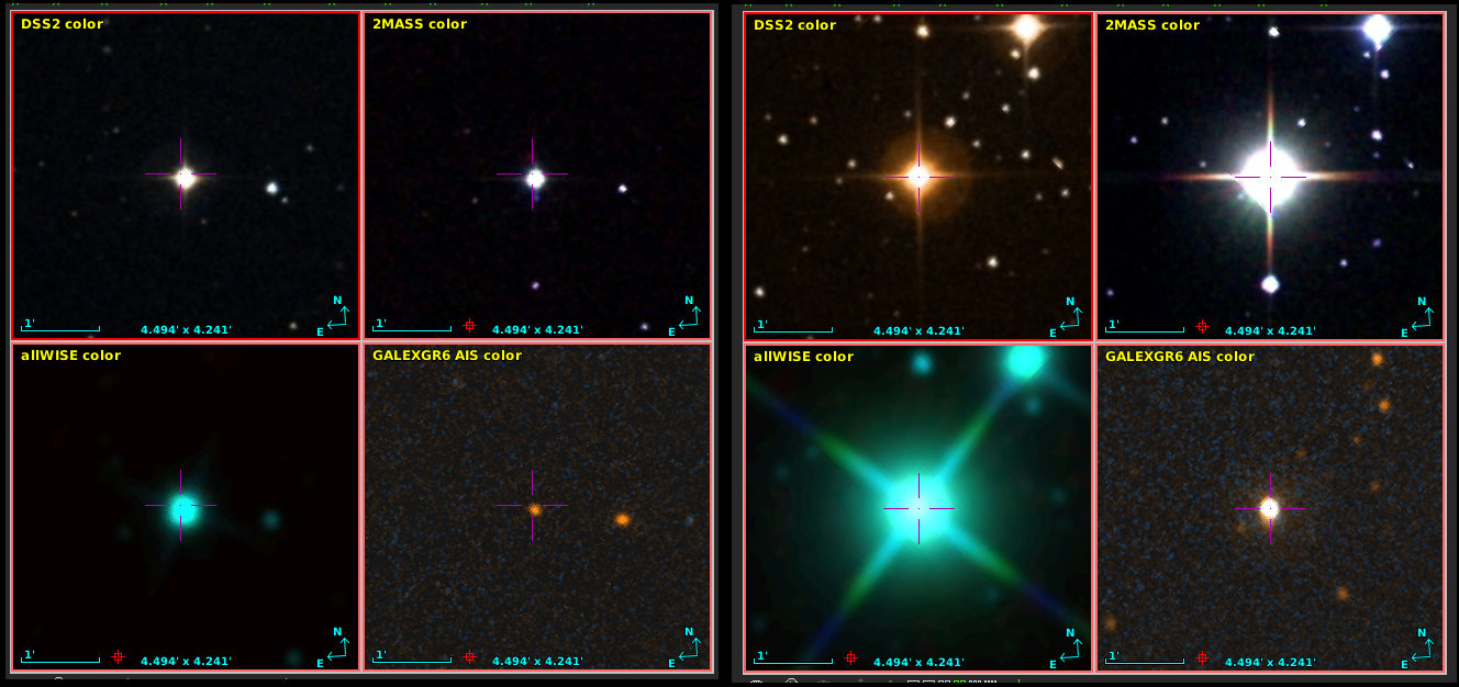
    The loneliest star in the sky on the left, and on the right a somewhat more lonelier one (it's explained in the text). The inset shows the distribution of the 500 loneliest stars on the whole sky in Galactic coordinates.

    In early December, the object catalogue of Gaia's data release 3 was published (“eDR3“), and I've been busy in various ways on this data off and on since then – see, for instance, the The Case of the disappearing bits on this blog.

    One of the things I have missed when advising people on projects with previous Gaia data releases is a table that, for every object, gives the nearest neighbour. And so for this release I've created it and christened it, perhaps just a bit over-grandiosely, “Gaia eDR3 Autocorrelation”. Technically, it is just a long (1811709771 rows, to be precise) list of pairs of Gaia eDR3 source ids, the ids of their nearest neighbour, and a spherical distance between.

    This kind of data is useful for many applications, mostly when looking for objects that are close together or (more often) things that fail for such close pairs for a wide variety of reasons. I have taken some pains to not only have close neighbours, though, because sometimes you may want specifically objects far away from others.

    As in the case of this article's featured image: The loneliest star in the sky (as seen by Gaia, that is) is eDR3 6049144983226879232, which is 4.3 arcminutes from its neighbour, 6049144021153793024, which in turn is the second-loneliest star in the sky. They are, perhaps a bit surprisingly, in Ophiuchus (and thus fairly close to the Milky Way plane), and (probably) only about 150 parsec from Earth. Doesn't sound too lonely, hm? Turns out: these stars are lonely because dust clouds blot out all their neighbours.

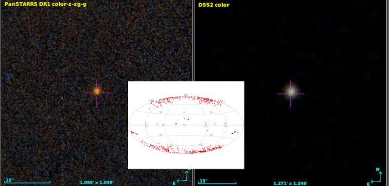
    Rank three is in another dust cloud, this time in Taurus, and so it continues in low Galactic latitude to rank 8 (4402975278134691456) at Galactic latitude 36.79 degrees; visualising the thing, it turns out it's again in a dark cloud. What about rank 23 at 83.92 Galactic (3954600105683842048)? That's probably bona-fide, or at least it doesn't look very dusty in the either DSS or PanSTARRS. Coryn (see below) estimates it's about 1100 parsec away. More than 1 kpc above the galactic disk: that's more what I had expected for lonely stars.

    Looking at the whole distribution of the 500 loneliest stars (inset above), things return a bit more to what I had expected: Most of them are around the galactic poles, where the stellar density is low.

    So: How did I find these objects? Here's the ADQL query I've used:

    SELECT TOP 500
      ra, dec, source_id, phot_g_mean_mag, ruwe,
      r_med_photogeo,
      partner_id, dist,
      COORD2(gavo_transform('ICRS', 'GALACTIC',
        point(ra, dec))) AS glat
    FROM
      gedr3dist.litewithdist
      NATURAL JOIN gedr3auto.main
    ORDER BY dist DESC
    

    – run this on the TAP server at http://dc.g-vo.org/tap (don't be shy, it's a cheap query).

    Most of this should be familiar to you if you've worked through the first pages of ADQL course. There's two ADQL things I'd like to advertise while I have your attention:

    1. NATURAL JOIN is like a JOIN USING, except that the database auto-selects what column(s) to join on by matching the columns that have the same name. This is a convenient way to join tables designed to be joined (as they are here). And it probably won't work at all if the tables haven't been designed for that.
    2. The messy stuff with GALACTIC in it. Coordinate transformations had a bad start in ADQL; the original designers hoped they could hide much of this; and it's rarely a good idea in science tools to hide complexity essentially everyone has to deal with. To get back on track in this field, DaCHS servers since about version 1.4 have been offering a user defined function gavo_transfrom that can transform (within reason) between a number of popular reference frames. You will find more on it in the server's capabilities (in TOPCAT: the “service” tab). What is happening in the query is: I'm making a Point out of the RA and Dec given in the catalogue, tell the transform function it's in ICRS and ask it to make Galactic coordinates from it, and then take the second element of the result: the latitude.

    And what about the gedr3dist.litewithdist table? That doesn't look a lot like the gaiaedr3.gaiasource we're supposed to query for eDR3?

    Well, as for DR2, I'm again only carrying a “lite” version of the Gaia catalogue in GAVO's Heidelberg data center, stripped down to the columns you absolutely cannot live without even for the most gung-ho science; it's called gaia.edr3lite.

    But then my impression is that almost everyone wants distances and then hacks something to make Gaia's parallax work for them. That's a bad idea as the SNR goes down to levels very common in the Gaia result catalogue (see 2020arXiv201205220B if you don't take my word for it). Hence, I'm offering a pre-joined view (a virtual table, if you will) with the carefully estimated distances from Coryn Bailer-Jones, and that's this gedr3dist.litewithdist. Whenever you're doing something with eDR3 and distances, this is where I'd point you first.

    Oh, and I should be mentioning that, of course, I figured out what is in dust clouds and what is not with TOPCAT and Aladin as in our tutorial TOPCAT and Aladin working together (which needs a bit of an update, but you'll figure it out).

    There's a lot more fun to be had with this (depending on what you find fun in). What about finding the 10 arcsec-pairs with the least different luminosities (which might actually be useful for testing some optics)? Try this:

    SELECT TOP 300
      a.source_id, partner_id, dist,
      a.phot_g_mean_mag AS source_mag,
      b.phot_g_mean_mag AS partner_mag,
      abs(a.phot_g_mean_mag-b.phot_g_mean_mag) AS magdiff
    FROM gedr3auto.main
      NATURAL JOIN gaia.edr3lite AS a
      JOIN gaia.edr3lite AS b
        ON (partner_id=b.source_id)
    WHERE
      dist BETWEEN 9.999/3600 AND 10.001/3600
      AND a.phot_g_mean_mag IS NOT NULL
      AND b.phot_g_mean_mag IS NOT NULL
    ORDER BY magdiff ASC
    

    – this one takes a bit longer, as there's many 10 arcsec-pairs in eDR3; the query above looks at 84690 of them. Of course, this only returns really faint pairs, and given the errors stars that weak have they're probably not all that equal-luminosity as that. But fixing all that is left as an exercise to the reader. Given there's the RP and BP magnitude columns, what about looking for the most colourful pair with a given separation?

    Acknowledgement: I couldn't have coolly mumbled about Ophiuchus or Taurus without the SCS service ivo://cds.vizier/vi/42 (”Identification of a Constellation From Position, Roman 1982”).

    Update [2021-02-05]: I discovered an extra twist to this story: Voyager 1 is currently flying towards Ophiuchus (or so Wikipedia claims). With an industrial size package of artistic licence you could say: It's coming to keep the loneliest star company. But of course: by the time Voyager will be 150 pc from earth, eDR3 6049144983226879232 will quite certainly have left Ophiuchus (and Voyager will be in a completely different part of our sky, that wouldn't look familar to us at all) – so, I'm afraid apart from a nice conincidence in this very moment (galactically speaking), this whole thing won't be Hollywood material.

  • The Bochum Galactic Disk Survey

    Patches of higher perceived variability on the Sky

    Fig 1: How our haphazard variability ratio varies over the sky (galactic coordinates). And yes, it's clear that this isn't dominated by physical variability.

    About a year ago, I reported on a workshop on “Large Surveys with Small Telescopes” in Bamberg; at around the same time, I've published an example for those, the Bochum Galactic Disk Survey BGDS, which used a twin 15 cm robotic telescope in some no longer forsaken place in the Andes mountains to monitor the brighter stars in the southern Milky Way. While some tables from an early phase of the survey have been on VizieR for a while, we now publish the source images (also in SIAP and Obscore), the mean photometry (via SCS and TAP) and, perhaps potentially most fun of all, the the lightcurves (via SSAP and TAP) – a whopping 35 million of the latter.

    This means that in tools like Aladin, you can now find such light curves (and images in two bands from a lot of epochs) when you are in the survey's coverage, and you can run TAP queries on GAVO's http://dc.g-vo.org/tap server against the full photometry table and the time series.

    Regular readers of this blog will not be surprised to see me use this as an excuse to show off a bit of ADQL trickery.

    If you have a look at the bgds.phot_all table in your favourite TAP client, you'll see that it has a column amp, giving the difference between the highest and lowest magnitude. The trouble is that amp for almost all objects just reflects the measurement error rather than any intrinsic variability. To get an idea what's “normal” (based on the fact that essentially all stars have essentially constant luminosity on the range and resolution scales considered here), run a query like:

    SELECT ROUND(amp/err_mag*10)/10 AS bin, COUNT(*) AS n
    FROM bgds.phot_all
    WHERE nobs>10
    GROUP BY bin
    

    As this scans the entire 75 million rows of the table, you will probably have to use async mode to run this.

    distribution of amplitude/mag errors

    Figure 2: The distribution of amplitude over magnitude error for all BGDS objects with nobs>10 (blue) and the subset with a mean magnitude brighter than 15 (blue).

    When it comes back, you will have, for objects where any sort of statistics make sense at all (hence nobs>10), a histogram (of sorts) of the amplitude in units of upstream's magnitude error estimation. If you log-log-plot this, you'll see something like Figure 2. The curve at least tells you that the magnitude error estimate is not very far off – the peak at about 3 “sigma” is not unreasonable since about half of the objects have nobs of the order of a hundred and thus would likely contain outliers that far out assuming roughly Gaussian errors.

    And if you're doing a rough cutoff at amp/magerr>10, you will get perhaps not necessarily true variables, but, at least potentially interesting objects.

    Let's use this insight to see if we spot any pattern in the distribution of these interesting objects. We'll use the HEALPix technique I've discussed three years ago in this blog, but with a little twist from ADQL 2.1: The Common Table Expressions or CTEs I have already mentioned in my blog post on ADQL 2.1 and then advertised in the piece on the Henry Draper catalogue. The brief idea, again, is that you can write queries and give them a name that you can use elsewhere in the query as if it were an actual table. It's not much different from normal subqueries, but you can re-use CTEs in multiple places in the query (hence the “common”), and it's usually more readable.

    Here, we first create a version of the photometry table that contains HEALPixes and our variability measure, use that to compute two unsophisticated per-HEALPix statistics and eventually join these two to our observable, the ratio of suspected variables to all stars observed (the multiplication with 1.0 is a cheap way to make a float out of a value, which is necessary here because a/b does integer division in ADQL if a and b are both integers):

    WITH photpoints AS (
      SELECT
        amp/err_mag AS redamp,
        amp,
        ivo_healpix_index(5, ra, dec) AS hpx
      FROM bgds.phot_all
      WHERE
        nobs>10
        AND band_name='SDSS i'
        AND mean_mag<16),
    all_objs AS (
      SELECT count(*) AS ct,
        hpx
        FROM photpoints GROUP BY hpx),
    strong_var AS (
      SELECT COUNT(*) AS ct,
        hpx
        FROM photpoints
        WHERE redamp>4 AND amp>1 GROUP BY hpx)
    SELECT
      strong_var.ct/(1.0*all_objs.ct) AS obs,
      all_objs.ct AS n,
      hpx
    FROM strong_var JOIN all_objs USING (hpx)
    WHERE all_objs.ct>20
    

    If you plot this using TOPCAT's HEALPix thingy and ask it to use Galactic coordinates, you'll end up with something like Figure 1.

    There clearly is some structure, but given that the variables ratio reaches up to 0.2, this is still reflecting instrumental or pipeline effects and thus earthly rather than Astrophysics. And that's going beyond what I'd like to talk about on a VO blog, although I'l take any bet that you will see significant structure in the spatial distribution of the variability ratio at about any magnitude cutoff, since there are a lot of different population mixtures in the survey's footprint.

    Be that as it may, let's have a quick look at the time series. As with the short spectra from Byurakan use case, we've stored the actual time series as arrays in the database (the mjd and mags columns in bgds.ssa_time_series. Unfortunately, since they are a lot less array-like than homogeneous spectra, it's also a lot harder to do interesting things with them without downloading them (I'm grateful for ideas for ADQL functions that will let you do in-DB analysis for such things). Still, you can at least easily download them in bulk and then process them in, say, python to your heart's content. The Byurakan use case should give you a head start there.

    For a quick demo, I couldn't resist checking out objects that Simbad classifies as possible long-period variables (you see, as I write this, the public bohei over Betelgeuse's brief waning is just dying down), and so I queried Simbad for:

    SELECT ra, dec, main_id
    FROM basic
    WHERE
      otype='LP?'
      AND 1=CONTAINS(
         POINT('', ra, dec),
         POLYGON('', 127, -30, 112, -30, 272, -30, 258, -30))
    

    (as of this writing, Simbad still needs the ADQL 2.0-compliant first arguments to POINT and POLYGON), where the POLYGON is intended to give the survey's footprint. I obtained that by reading off the coordinates of the corners in my Figure 1 while it was still in TOPCAT. Oh, and I had to shrink it a bit because Simbad (well, the underlying Postgres server, and, more precisely, its pg_sphere extension) doesn't want polygons with edges longer than π. This will soon become less pedestrian: MOCs in relational databases are coming; more on this soon.

    TOPCAT action shot with a light curve display

    Fig 3: V566 Pup's BGDS lightcuve in a TOPCAT configured to auto-plot the light curves associated with a row from the bgds.ssa_time_series table on the GAVO DC TAP service.

    If you now do the usual spiel with an upload crossmatch to the bgds.ssa_time_series table and check “Plot Table” in Views/Activation Action, you can quickly page through the light curves (TOPCAT will keep the plot style as you go from dataset to dataset, so it's worth configuring the lines and the error bars). Which could bring you to something like Fig. 3; and that would suggest that V* V566 Pup isn't really long-period unless the errors are grossly off.

  • LAMOST5 meets Datalink

    One of the busiest spectral survey instruments operated right now is the Large Sky Area Multi-Object Fiber Spectrograph Telescope (LAMOST). And its data in the VO, more or less: DR2 and DR3 have been brought into the VO by our Czech colleagues, but since they currently lack resources to update their services to the latest releases, they have kindly given me their DaCHS resource descriptor, and so I had a head start for publishing DR5 in Heidelberg.

    With some minor updates, here it is now: Over nine million medium-resolution spectra covering large parts of the northen sky – the spatial coverage is like this:

    Coverage Healpix map

    There's lots of fun to be had with this; of course, there's an SSA service, so when you point Aladin or Splat at some part of the covered sky and look for spectra, chances are you'll see LAMOST spectra, and when working on some of our tutorials (this one, for example), it happened that LAMOST actually had what I was looking for when writing them.

    But I'd like to use the opportunity to mention two other modes of accessing the data.

    Stacked spectra

    Tablesample and TOPCAT's Plot Table activation action

    Say you'd like to look at spectra of M stars and would like to have some sample from across the sky, fire up TOPCAT, point its TAP client the GAVO DC TAP service (http://dc.g-vo.org/tap) and run something like:

    select
      ssa_pubDID, accref, raj2000, dej2000, ssa_targsubclass
    from lamost5.data tablesample(1)
    where
      ssa_targsubclass like 'M%'
    

    This is using the TABLESAMPLE modifier in the from clause, which isn't standard ADQL yet. As mentioned in the DaCHS 1.4 announcement, DaCHS has a prototype implementation of what's been discussed on the IVOA's DAL mailing list: pick a part of a table rather than the full one. It takes a percentage as an argument, and tells the server to choose about this percentage of the table's records using a reasonable and fast heuristic. Note that this won't give you perfect statistical sampling, but if it's not “good enough” for some purpose, I'd like to learn about that purpose.

    Drawing a proper statistical sample, on the other hand, would take minutes on the GAVO database server – with tablesample, I had the roughly 6000 spectra the above query returns essentially instantaneously, and from eyeballing a sky plot of them, I'd say their distribution is close enough to that of the full DR5. So: tablesample is your friend.

    For a quick look at the spectra themselves, in TOPCAT click Views/Activation Actions, check “Plot Table” and make sure TOPCAT proposes the accref column as “Table Location” (if you don't see these items, update your TOPCAT – it's worth it). Now click on a row or perhaps a dot on a plot and behold an M spectrum.

  • From Byurakan to L2: Short Spectra

    A snapshot from the DFBS tutorial: Carbon Stars in different spectral bands.

    A snapshot from the DFBS tutorial: Carbon Stars in different spectral bands.

    On June 30, a small project we've done together with the Armenian Virtual Observatory has ended. Its objective was to publish the spectra from the First Byurakan Survey (the DFBS) in a VO-compilant way. The data comes from one of the big surveys with Schmidt telescopes that form a sizable part of the observational heritage from the second part of the 20th century (you're still using a few of them daily if you tell Aladin to show a DSS plane).

    In this case, spectra from objects on the entire northern sky off the milky way down to about 18th mag were obtained. In a previous cooperation between Armenian and Italian astronomers a good decade ago, the plates were digitised and calibrated, and spectra were extracted. However, they resided behind a web interface so far, which made them somewhat clumsy to work with.

    Now, they're in the VO, and to give you a few ideas for what kind of things you can do with this kind of data, within the project we've also written the tutorial “Outlier Analysis in Low-Resolution Spectra”.

    Have a glance at the tutorial – you see, while the Byurakan survey certainly is a valuable resource by itself, I happen to believe at this point it's particularly valuable because with the next Gaia data release (planned for next year), a deluxe version of it will come: Gaia's RP/BP spectra will be all-sky, properly calibrated, and quite a bit deeper, but still low-resolution. So, if you're just waiting for such a data collection, you can train your methods right now on the DFBS.

  • APPLAUSE via Obscore

    A composite of two rather noisy photo plates

    Aladin showing some Bamberg Sky Patrol plates (see towards the end of the post for what this is and how I made it).

    At the Astroplate conference I blogged about recently, the people behind APPLAUSE gave a couple of talks about their Data Release 3. APPLAUSE is a fairly massive endeavour to make available data from some of the larger plate archives in Germany, and its DR3 even hit the non-Astronomy press last February.

    Already for previous APPLAUSE releases, I've wanted to bring this data (or rather, its metadata) to the VO, but it never quite happened, basically because there was always another little thing that turned out to be too tedious to work out via mail. However, working out things interactively is exactly what conferences are great for. So, the kind APPLAUSE folks (thanks, Taavi and Harry) and I used the Astroplate to map their database schema (“schema” is jargon for what boils down to the set of tables and columns with which they describe their data) to the much simpler (and, admittedly, less powerful) IVOA Obscore one.

    Sure, Obscore doesn't deal with multiple exposures (like when the target field and the north pole were exposed on one plate to help precision photometry), object-guided images, and all the other interesting techniques that astronomers applied in the pre-digital age; it also doesn't usefully cope with multiple scans of the same plate (for instance, to correct for imprecisions in the mechanics of flatbed scanners). APPLAUSE, of course, has to cope with them, since there are many reasons to preserve data of this kind.

    Obscore, on the other hand, is geared towards uniform discovery, where too funky datasets in all likelihood cause more harm than good. So, when we mapped APPLAUSE to Obscore, of the 101138 scans of 70276 plates that the full APPLAUSE holds in DR3, only 44000 plate scans made it into the Obscore table. The advantage: whatever can be sensibly mapped to Obscore can now be queried together with all the other data in the world that others have published through Obscore.

    You can immediately see the effect when you run the little python program doing the global discovery we gave in our plates tutorial. Here's what it prints now (values from pre-APPLAUSE-in-Obscore are in square brackets):

    Column t_exptime: 3460 values
      Min   12, Max 15300, Mean 890.24  [previous mean: 370.722]
    ---
    Column em_mean: 3801 values
      Min 1.8081e-09, Max 9.3e-07, Mean 6.40804e-07 [No change: Sigh!]
    ---
    Column t_mean: 4731 values
      Min 12564.5, Max 58126.3, Mean 49897.9 [previous mean: 51909.1]
    ---
    Column instrument_name: 4747 values
      Matches from , Petzval, [Max Wolf's residence in
      Heidelberg, Maerzgasse, Wolf's Doppelastrograph,
      Heidelberg Koenigstuhl (24), Wolf's
      Doppelastrograph,] AG-Astrograph, [Zeiss Triplet
      15 cm Potsdam-Telegrafenberg], Zeiss Triplet,
      Astrograph (four 10-cm Tessar f/6 cameras),
      [3.5m APO, ROSAT PSPCC, Heidelberg Koenigstuhl
      (24), Bruce Astrograph, Calar Alto (493),
      Schmidt], Grosser Refraktor, [ROSAT HRI,
      DK-1.54], Hamburger Schmidt-Spiegel,
      [DFOSC_FASU], ESO 1-metre Schmidt telescope,
      Great Schmidt Camera, Lippert-Astrograph, Ross-B
      3", [AZT 22], Astrograph (six 10-cm Tessar f/6
      cameras), 1m-Spiegelteleskop, [ROSAT PSPCB],
      Astrograph (ten 10-cm Tessar f/6 cameras), Zeiss
      Objective
    ---
    Column access_url: 4747 values [4067]
    

    So – for the fields selected in the tutorial, there are 15% more images in the global Obscore image pool now than there were before APPLAUSE, and their mean observation date went a bit farther into the past. I've not made any statistics, but I suspect for many other fields the gain is going to be much higher. For a strong effect, try some random region covered by the Bamberg Sky Patrol on the southern sky.

    But you have probably noticed the deep sigh in the annotations to the statistics above: Yes, we don't have the spectral band for the APPLAUSE data, which is why the stats on em_min doesn't change. As a matter of fact, from the Obscore data you can't even guess whether a plate is “more red” or “rather blue”, as Obscore doesn't have an (agreed-upon) field for “qualititive bandpass indicator”.

    For some other data collections, we did map known emulsion/filter combinations to rough bandpasses (e.g., the Palomar-Leiden Trojan Survey, which only had a few of them). For APPLAUSE, there are 435 combinations of filter and emulsion (that's a VOTable link that you can paste into TOPCAT's load button in order to have a look at the table). Granted, quite a few of these pairs are (more or less) spurious because of inconsistent spelling. But we still gave up on researching the bandpasses even before we started.

    If you're a photographic plate buff: You could help us and posteriority a lot if you could go through this list and at least for some combinations tell us what, roughly, the lower and upper limits of the corresponding bandpasses might have been (what DaCHS already knows, plate-relevant data near the bottom of the file). As usual, send mail to gavo@ari.uni-heidelberg.de if you have anything to contribute.

    Finally, here's the brief explanation of the image for this article: Well, I wanted to find some Bamberg Sky Patrol images for a single field to play with. I knew they were primarily located in the South, and were made using Tessar cameras. So, I ran:

    SELECT t_min, access_url, s_region
    FROM ivoa.obscore
    WHERE instrument_name like '%Tessar%'
    AND 1=CONTAINS(POINT(345, -38), s_region)
    

    on GAVO's TAP service. Since Aladin 10, you can do that from within the program (although some versions will reject this query because they mistakenly believe the ADQL is bad. Query through TOPCAT and send the result over to Aladin if that bites you). Incidentally, when there are s_region values in Obscore tables, it's a good idea to use them as I do here, as it's quite a bit more likely that this query will use indices than some condition on s_ra and s_dec. But then not all services fill s_region properly, so for all-VO queries you will probably want to make do with s_ra and s_dec.

    From that result I first made the inset bar graph in the article image to show the temporal distribution of the Patrol plates. And then I grabbed two (rather randomly selected) plates and had Aladin produce a red-blue composite of them. Whatever is really red or really blue in that image may correspond to a transient event. Or, as certainly the case with that little hair (or whatever) that shines out in blue, it may not.

« Page 2 / 4 »