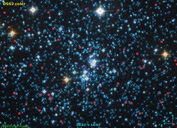
Around this time of the year on the northern hemisphere, you can spot the h and χ Persei double star cluster with the naked eye. One part of it, NGC 884 is shown here with LAMOST DR6 low resolution spectra (red squares) and Gaia DR3 XP spectra (blue crosses) overplotted. Given that LAMOST has already been one of the largest collections of spectra on the planet, you can see that there is really a lot of those XP spectra.
When Gaia DR3 was released in June, I was somewhat disappointed when I realised what it is that they delivered as the BP/RP (or XP for short) spectra. You see, I had expected to see something rather similar to what I have in DFBS: structurally, arrays of a few dozen spectral points, mapping wavelengths to some sort of measure of the flux.
What really came were, mainly, “continuous spectra“, that is coefficients of Gauss-Hermite polynomials. You can fetch them from the gaiadr3.xp_continuous_mean_spectrum table at the ARI-Gaia TAP service; the blue part of the spectrum of the star DR3 4295806720 looks like this in there:
102.93398893929992, -12.336921213781045, -2.668856168170544, -0.12631176306793765, -0.9347021092539146, 0.05636787290132809, [...]
No common spectral client can plot this. The Gaia DPAC has helpfully provided a Python library called GaiaXPy to turn these into “proper” spectra. Shortly after the data release, my plan has thus been to turn all these spectra into their “sampled” form using GaiaXPy and then re-publish them, both through SSAP for ad-hoc discovery and through TAP for (potentially) global analysis.
Alas, for objects too faint to make it into DR3's xp_sampled_mean_spectrum table (that's 35 million spectra already turned to wavelength-flux pairs by DPAC), the spectra generated in this way looked fairly awful, with lots of very artificial-looking wiggles (“ringing”, if you will). After a bit of deliberation, I realised that when the errors are given on the Hermite coefficients, once you compute the samples, these errors will be liberally distributed among the output samples. In other words, the error on the samples will be grossly correlated over arbitrary distances; at least I am fairly helpless when trying to separate signal from artefact in these beasts.
Bummer. Well, fortunately, Rene Andrae from “up the mountain” (i.e., the MPI for Astronomy) has worked out a reasonably elegant way to get more conventional spectra understandable to mere humans. Basically, you compute n distinct “realisations” of the error model given by the table of the continuous spectra and average over them. The more samples you take, the less correlated your spectral points and their errors will be and the less confusing the signal will be. The service docs for gaia/s3 give the math.
Doing this on more than 200 million spectra is quite an effort, though, and so after some experimentation I decided to settle on 10 realisations per spectrum and have relatively wide bins (10 nm) over just the optical part of the spectrum (400 through 800 nm). The BP and RP bandpaths are a bit wider, and there is probably signal blotted out by the wide bins; I will probably be addressing this for DR4, except if these spectra become the smash hit they deserve to be.
The result of this procedure is now available through an SSAP service that should show up in the VO Registry by the time the first of you read this; the Aladin image above gives you an impression of the density of results here – and don't forget: the spectra with the blue crosses are all reasonably well flux-calibrated.
The data is also available on the TAP service http://dc.g-vo.org/tap, which opens up many interesting possibilities. Let me mention two here.
Comparison with LAMOST
I was rather nervous whether what I had done resulted in anything that bore even a fleeting resemblance to reality, and so about the first thing I tried was to compare my new data with what LAMOST has.
That is a nice exercise for TAP and ADQL. Let's first match spectra from the two surveys, which luckily are on the same server, saving us some cross-server uploads. I am selecting a minimum of data, just the position and the two access URLs, and I let DaCHS' MAXREC kick in so I'm just retrieving 20000 of the millions of result records:
SELECT a.ssa_location, a.accref, b.accref
FROM
  gdr3spec.ssameta AS a
  JOIN lamost6.ssa_lrs AS b
  ON DISTANCE(a.ssa_location, b.ssa_location)<0.001
(this is using the DISTANCE(.,.)<radius idiom that we will be migrating towards in ADQL 2.1 instead of the dreaded 1=CONTAINS(POINT, CIRCLE) thing everyone has loathed in ADQL 2.0).
Using the nifty activation actions, you can now tell TOPCAT to open the two spectra next to each other when you click on a row or a point in a sky plot. To reproduce,
- Make a sky plot. TOPCAT doesn't yet pick up the POINT in ssa_location, so you have to configure the Lon and Lat fields yourself to ssa_location[0] and ssa_location[1].
- Open the activation actions, either from the button bar or from the Views menu.
- In there, select Plot Table, make sure it says accref in Table Location and then check Plot Table in the Actions pane. When you now click on a point in the sky plot, you should see a spectrum pop up, except it is plotted with dots, which most people consider inappropriate for spectra. Use the Form tab in the plot window to style it a bit more spectrum-like (I recommend looking into Line and XYError).
- But how do you now add the LAMOST plot? I don't think TOPCAT's activation actions let you plot right into the plane plot you just configured. But you can add a second Plot Table action from the Actions menu in the window with the activation actions. As before, configure this new item, except this one needs to plot accref_ (which is what DaCHS has called the access reference for LAMOST to keep the names unique).
- As for Gaia, configure to plot to look good as a spectrum. In order to make the two spectra optically comparable, under Axes set the range to 4000 to 8000 Angstrom manually here.
You can now click on points in your sky plot and, after a second or so, see the corresponding spectra next to each other (if you place the two plot windows that way).
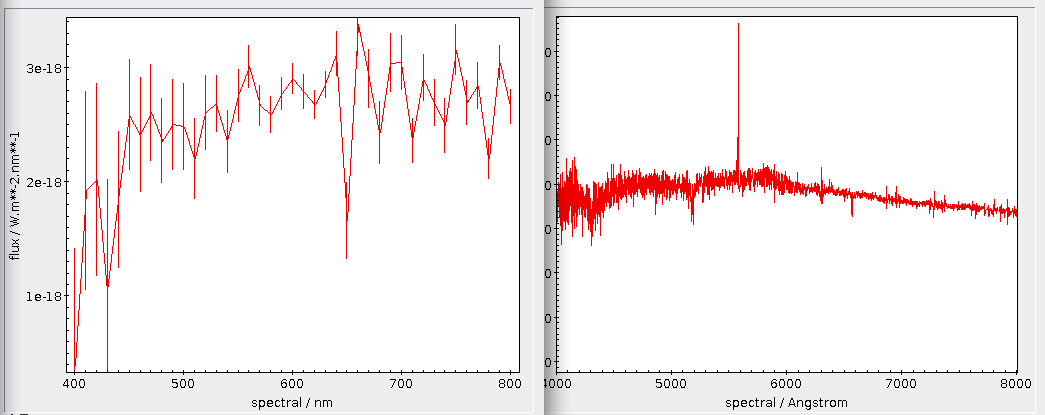
If you try this, you will (hopefully) see that major features of spectra are nicely reproduced, such as with these, I guess, molecular bands:
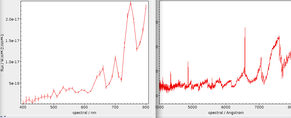
As you probably have guessed, the extremely low-resolution Gaia XP spectrum is left, LAMOST's (somewhat higher-resolution) low-resolution spectrum is right:
This also works with absorption in the blue, as in this example:
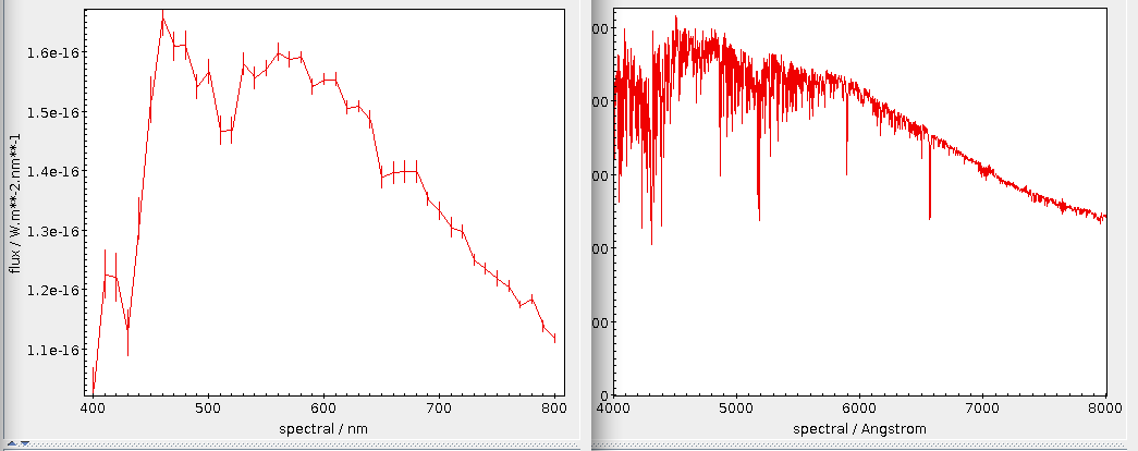
In case of doubt, I have to say I'd probably trust Gaia's calibration around 400 nm better than LAMOST's. But that's mere guesswork.
For fainter objects, you will see remnants of the systematic wiggles from the Hermite polynomials:
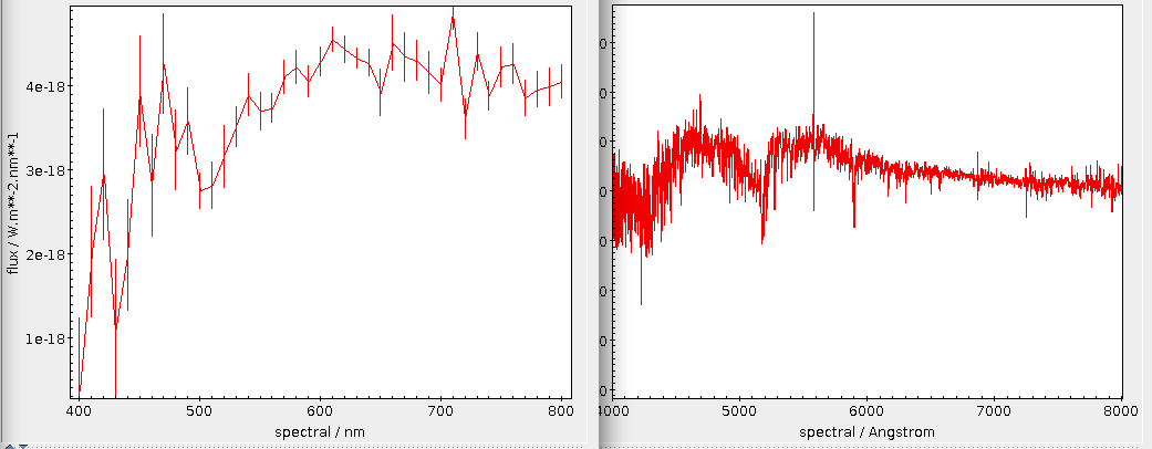
Anyway, if you keep an eye on the errors, you can probably even work with spectra from the fainter objects:
Mass Retrieval of Spectra
One nice thing about the short spectra is that you can fetch many of them in one go and in very little time. For instance, to retrieve particularly red objects from the Gaia catalogue of Nearby Stars (also on the GAVO server) with spectra, say:
SELECT
  source_id, ra, dec, parallax, phot_g_mean_mag,
  phot_bp_mean_mag, phot_rp_mean_mag, ruwe, adoptedrv,
  flux, flux_error
FROM gcns.main
JOIN gdr3spec.spectra
USING (source_id)
WHERE phot_rp_mean_mag<phot_bp_mean_mag-4
[in case you wonder how I quickly got the column names enumerated here: do control-clicks into the Columns pane in TOCPAT's TAP window and then use the Cols button]. For when you do not have Gaia DR3 source_id-s in your source table, there is also gdr3spec.withpos against which you can do more conventional positional crossmatches.
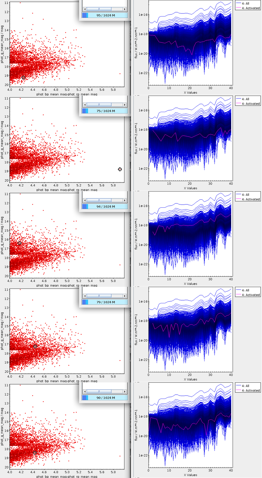
Within a few seconds, you can retrieve more than 4000 spectra in this way. You can now do whatever analysis you want on these spectra. Or, well, just plot them. The following procedure for that later task uses TOPCAT features only available in the next release, due before mid-October[1].
First, make a colour-magnitude diagram (CMD) from this table as usual (e.g., BP-RP vs G). Then, open another plane plot and
- Layers → Add XYArray Control
- Configure the XYArray to plot from the table you just fetched, have nothing in X Values[2] and flux in Y Values.
- Under Axes, configure Y Log in order to better show the 4253 spectra at one time.
- Throw away or at least uncheck all other layers in the plot.
- In order to let TOPCAT highlight the spectrum of the activated source, in the Subsets pane check the Activated subset (that's the bleeding-edge functionality you will not have in older TOPCATs) and give it a sufficiently bright colour.
With that, you can now click around in your CMD and immediately see that source's spectrum in the context of all the others, like this:
These spectra have also inspired me to design and implement a vector extension for ADQL, which lets you do even more interesting things with these spectra. More on this… soon.
| [1] | The Activated subset is only available in TOPCAT versions later than 4.8-7 (released in October 2022). |
| [2] | These should be the spectral points; DaCHS does not deliver them with this query because I am a coward. I think I will find my courage relatively soon and then fix this. Once that has happened, you can select param$spectral as X values. [Update: Mark Taylor remarks that by writing sequence(41, 400, 10) in bleeding-edge TOPCATs and add(multiply(10,sequence(41)),400) before that, you can add a proper spectral axis until then] |
Zitiert in: At the Gaia Passivation Event Another Virtual Interop A Proposed Vector Extension for ADQL A Proposed Vector Extension for ADQL

![[RSS]](./theme/image/rss.png)