Posts with the Tag Photometry:

  • Histograms and Hidden Open Clusters

    image: reddish pattern

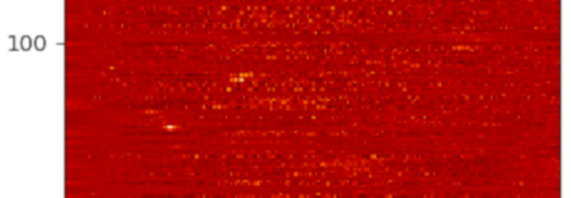
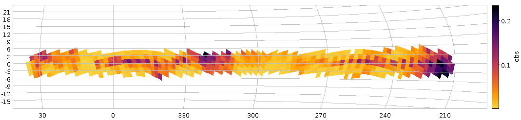
    Colour-coded histograms for distances of stars in the direction of some NGC open clusters -- one cluster per line, so you're looking a a couple of Gigabytes of data here. If you want this a bit more precise: Read the article and generate your own image.

    I have spent a bit of time last week polishing up what will (hopefully) be the definitive source of common ADQL User Defined Functions (UDFs) for IVOA review. What's a UDF, you ask? Well, it is an extension to ADQL where service operators can invent new functionality. If you have been following this blog for a while, you will probably remember the ivo_healpix_index function from our dereddening exercise (and some earlier postings): That was an UDF, too.

    This polishing work reminded me of a UDF I've wanted to blog about for a quite a while, available in DaCHS (and thus on our Heidelberg Data Center) since mid-2018: gavo_histogram. This, I claim, is a powerful tool for analyses over large amounts of data with rather moderate local means.

    For instance, consider this classic paper on the nature of NGC 2451: What if you were to look for more cases like this, i.e., (indulging in a bit of poetic liberty) open clusters hidden “behind” other open clusters?

    Somewhat more technically this would mean figuring out whether there are “interesting” patterns in the distance and proper motion histograms towards known open clusters. Now, retrieving the dozens of millions of stars that, say, Gaia, has in the direction of open clusters to just build histograms – making each row count for a lot less than one bit – simply is wasteful. This kind of counting and summing is much better done server-side.

    On the other hand, SQL's usual histogram maker, GROUP BY, is a bit unwieldy here, because you have lots of clusters, and you will not see anything if you munge all the histograms together. You could, of course, create a bin index from the distance and then group by this bin and the object name, somewhat like ...ROUND(r_est/20) as bin GROUP by name, bin – but that takes quite a bit of mangling before it can conveniently be used, in particular when you take independent distributions over multiple variables (“naive Bayesian”; but then it's the way to go if you want to capture dependencies between the variables).

    So, gavo_histogram to the rescue. Here's what the server-provided documentation has to say (if you use TOPCAT, you will find this in the ”Service” tab in the TAP windows' ”Use Service” tab):

    gavo_histogram(val REAL, lower REAL, upper REAL, nbins INTEGER) -> INTEGER[]
    
    The aggregate function returns a histogram of val with
    nbins+2 elements. Assuming 0-based arrays, result[0] contains
    the number of underflows (i.e., val<lower), result[nbins+1]
    the number of overflows. Elements 1..nbins are the counts in
    nbins bins of width (upper-lower)/nbins. Clients will have to
    convert back to physical units using some external communication,
    there currently is no (meta-) data as to what lower and upper was in
    the TAP response.
    

    This may sound a bit complicated, but the gist really is: type gavo_histogram(r_est, 0, 2000, 20) as hist, and you will get back an array with 20 bins, roughly 0..100, 100..200, and so on, and two extra bins for under- and overflows.

    Let's try this for our open cluster example. The obvious starting point is selecting the candidate clusters; we are only interested in famous clusters, so we take them from the NGC (if that's too boring for you: with TAP uploads you could take the clusters from Simbad, too), which conveniently sits in my data center as openngc.data:

    select name, raj2000, dej2000, maj_ax_deg
    from openngc.data
    where obj_type='OCl'
    

    Then, we need to add the stars in their rough directions. That's a classic crossmatch, and of course these days we use Gaia as the star catalogue:

    select name, source_id
    from openngc.data
    join gaia.dr2light
    on (
      1=contains(
        point(ra,dec),
        circle(raj2000, dej2000, maj_ax_deg)))
    where obj_type='OCl')
    

    This is now a table of cluster names and Gaia source ids of the candidate stars. To add distances, you could fiddle around with Gaia parallaxes, but because there is a 1/x involved deriving distances, the error model is complicated, and it is much easier and safer to adopt Bailer-Jones et al's pre-computed distances and join them in through source_id.

    And that distance estimation, r_est, is exactly what we want to take our histograms over – which means we have to group by name and use gavo_histogram as an aggregate function:

    with ocl as (
      select name, raj2000, dej2000, maj_ax_deg, source_id
      from openngc.data
      join gaia.dr2light
      on (
        1=contains(
          point(ra,dec),
          circle(raj2000, dej2000, maj_ax_deg)))
      where obj_type='OCl')
    
    select
      name,
      gavo_histogram(r_est, 0, 4000, 200) as hist
    from
      gdr2dist.main
      join ocl
      using (source_id)
    where r_est!='NaN'
    group by name
    

    That's it! This query will give you (admittedly somewhat raw, since we're ignoring the confidence intervals) histograms of the distances of stars in the direction of all NGC open clusters. Of course, it will run a while, as many millions of stars are processed, but TAP async mode easily takes care of that.

    Oh, one odd thing is left to discuss (ignore this paragraph if you don't know what I'm talking about): r_est!='NaN'. That's not quite ADQL but happens to do the isnan of normal programming languages at least when the backend is Postgres: It is true if computations failed and there is an actual NaN in the column. This is uncommon in SQL databases, and normal NULLs wouldn't hurt gavo_histogram. In our distance table, some NaNs slipped through, and they would poison our histograms. So, ADQL wizards probably should know that this is what you do for isnan, and that the usual isnan test val!=val doesn't work in SQL (or at least not with Postgres).

    So, fire up your TOPCAT and run this on the TAP server http://dc.g-vo.org/tap.

    You will get a table with 618 (or so) histograms. At this point, TOPCAT can't do a lot with them. So, let's emigrate to pyVO and save this table in a file ocl.vot

    My visualisation proposition would be: Let's substract a “background” from the histograms (I'm using splines to model that background) and then plot them row by row; multi-peaked rows in the resulting image would be suspicious.

    This is exactly what the programme below does, and the image for this article is a cutout of what the code produces. Set GALLERY = True to see how the histograms and background fits look like (hit 'q' to get to the next one).

    In the resulting image, any two yellow dots in one line are at least suspicious; I've spotted a few, but they are so consipicuous that others must have noticed. Or have they? If you'd like to check a few of them out, feel free to let me know – I think I have a few ideas how to pull some VO tricks to see if these things are real – and if they've been spotted before.

    So, here's the yellow spot programme:

    from astropy.table import Table
    import matplotlib.pyplot as plt
    import numpy
    from scipy.interpolate import UnivariateSpline
    
    GALLERY = False
    
    def substract_background(arr):
        x = range(len(arr))
        mean = sum(arr)/len(arr)
        arr = arr/mean
        background = UnivariateSpline(x, arr, s=100)
        cleaned = arr-background(x)
    
        if GALLERY:
            plt.plot(x, arr)
            plt.plot(x, background(x))
            plt.show()
    
        return cleaned
    
    
    def main():
        tab = Table.read("ocl.vot")
        hist = numpy.array([substract_background(r["hist"][1:-1])
          for r in tab])
        plt.matshow(hist, cmap='gist_heat')
        plt.show()
    
    
    if __name__=="__main__":
        main()
    
  • The Bochum Galactic Disk Survey

    Patches of higher perceived variability on the Sky

    Fig 1: How our haphazard variability ratio varies over the sky (galactic coordinates). And yes, it's clear that this isn't dominated by physical variability.

    About a year ago, I reported on a workshop on “Large Surveys with Small Telescopes” in Bamberg; at around the same time, I've published an example for those, the Bochum Galactic Disk Survey BGDS, which used a twin 15 cm robotic telescope in some no longer forsaken place in the Andes mountains to monitor the brighter stars in the southern Milky Way. While some tables from an early phase of the survey have been on VizieR for a while, we now publish the source images (also in SIAP and Obscore), the mean photometry (via SCS and TAP) and, perhaps potentially most fun of all, the the lightcurves (via SSAP and TAP) – a whopping 35 million of the latter.

    This means that in tools like Aladin, you can now find such light curves (and images in two bands from a lot of epochs) when you are in the survey's coverage, and you can run TAP queries on GAVO's http://dc.g-vo.org/tap server against the full photometry table and the time series.

    Regular readers of this blog will not be surprised to see me use this as an excuse to show off a bit of ADQL trickery.

    If you have a look at the bgds.phot_all table in your favourite TAP client, you'll see that it has a column amp, giving the difference between the highest and lowest magnitude. The trouble is that amp for almost all objects just reflects the measurement error rather than any intrinsic variability. To get an idea what's “normal” (based on the fact that essentially all stars have essentially constant luminosity on the range and resolution scales considered here), run a query like:

    SELECT ROUND(amp/err_mag*10)/10 AS bin, COUNT(*) AS n
    FROM bgds.phot_all
    WHERE nobs>10
    GROUP BY bin
    

    As this scans the entire 75 million rows of the table, you will probably have to use async mode to run this.

    distribution of amplitude/mag errors

    Figure 2: The distribution of amplitude over magnitude error for all BGDS objects with nobs>10 (blue) and the subset with a mean magnitude brighter than 15 (blue).

    When it comes back, you will have, for objects where any sort of statistics make sense at all (hence nobs>10), a histogram (of sorts) of the amplitude in units of upstream's magnitude error estimation. If you log-log-plot this, you'll see something like Figure 2. The curve at least tells you that the magnitude error estimate is not very far off – the peak at about 3 “sigma” is not unreasonable since about half of the objects have nobs of the order of a hundred and thus would likely contain outliers that far out assuming roughly Gaussian errors.

    And if you're doing a rough cutoff at amp/magerr>10, you will get perhaps not necessarily true variables, but, at least potentially interesting objects.

    Let's use this insight to see if we spot any pattern in the distribution of these interesting objects. We'll use the HEALPix technique I've discussed three years ago in this blog, but with a little twist from ADQL 2.1: The Common Table Expressions or CTEs I have already mentioned in my blog post on ADQL 2.1 and then advertised in the piece on the Henry Draper catalogue. The brief idea, again, is that you can write queries and give them a name that you can use elsewhere in the query as if it were an actual table. It's not much different from normal subqueries, but you can re-use CTEs in multiple places in the query (hence the “common”), and it's usually more readable.

    Here, we first create a version of the photometry table that contains HEALPixes and our variability measure, use that to compute two unsophisticated per-HEALPix statistics and eventually join these two to our observable, the ratio of suspected variables to all stars observed (the multiplication with 1.0 is a cheap way to make a float out of a value, which is necessary here because a/b does integer division in ADQL if a and b are both integers):

    WITH photpoints AS (
      SELECT
        amp/err_mag AS redamp,
        amp,
        ivo_healpix_index(5, ra, dec) AS hpx
      FROM bgds.phot_all
      WHERE
        nobs>10
        AND band_name='SDSS i'
        AND mean_mag<16),
    all_objs AS (
      SELECT count(*) AS ct,
        hpx
        FROM photpoints GROUP BY hpx),
    strong_var AS (
      SELECT COUNT(*) AS ct,
        hpx
        FROM photpoints
        WHERE redamp>4 AND amp>1 GROUP BY hpx)
    SELECT
      strong_var.ct/(1.0*all_objs.ct) AS obs,
      all_objs.ct AS n,
      hpx
    FROM strong_var JOIN all_objs USING (hpx)
    WHERE all_objs.ct>20
    

    If you plot this using TOPCAT's HEALPix thingy and ask it to use Galactic coordinates, you'll end up with something like Figure 1.

    There clearly is some structure, but given that the variables ratio reaches up to 0.2, this is still reflecting instrumental or pipeline effects and thus earthly rather than Astrophysics. And that's going beyond what I'd like to talk about on a VO blog, although I'l take any bet that you will see significant structure in the spatial distribution of the variability ratio at about any magnitude cutoff, since there are a lot of different population mixtures in the survey's footprint.

    Be that as it may, let's have a quick look at the time series. As with the short spectra from Byurakan use case, we've stored the actual time series as arrays in the database (the mjd and mags columns in bgds.ssa_time_series. Unfortunately, since they are a lot less array-like than homogeneous spectra, it's also a lot harder to do interesting things with them without downloading them (I'm grateful for ideas for ADQL functions that will let you do in-DB analysis for such things). Still, you can at least easily download them in bulk and then process them in, say, python to your heart's content. The Byurakan use case should give you a head start there.

    For a quick demo, I couldn't resist checking out objects that Simbad classifies as possible long-period variables (you see, as I write this, the public bohei over Betelgeuse's brief waning is just dying down), and so I queried Simbad for:

    SELECT ra, dec, main_id
    FROM basic
    WHERE
      otype='LP?'
      AND 1=CONTAINS(
         POINT('', ra, dec),
         POLYGON('', 127, -30, 112, -30, 272, -30, 258, -30))
    

    (as of this writing, Simbad still needs the ADQL 2.0-compliant first arguments to POINT and POLYGON), where the POLYGON is intended to give the survey's footprint. I obtained that by reading off the coordinates of the corners in my Figure 1 while it was still in TOPCAT. Oh, and I had to shrink it a bit because Simbad (well, the underlying Postgres server, and, more precisely, its pg_sphere extension) doesn't want polygons with edges longer than π. This will soon become less pedestrian: MOCs in relational databases are coming; more on this soon.

    TOPCAT action shot with a light curve display

    Fig 3: V566 Pup's BGDS lightcuve in a TOPCAT configured to auto-plot the light curves associated with a row from the bgds.ssa_time_series table on the GAVO DC TAP service.

    If you now do the usual spiel with an upload crossmatch to the bgds.ssa_time_series table and check “Plot Table” in Views/Activation Action, you can quickly page through the light curves (TOPCAT will keep the plot style as you go from dataset to dataset, so it's worth configuring the lines and the error bars). Which could bring you to something like Fig. 3; and that would suggest that V* V566 Pup isn't really long-period unless the errors are grossly off.

  • Find Outliers using ADQL and TAP

    Annie Cannon's notebook and a plot

    Two pages from Annie Cannon's notebooks[1], and a histogram of the basic BP-RP color distribution in the HD catalogue (blue) and the distribution of the outliers (red). For more of Annie Cannon's notebooks, search on ADS.

    The other day I gave one of my improvised live demos (“What, roughly, are you working on?”) and I ended up needing to translate identifiers from the Henry Draper Catalogue to modern positions. Quickly typing “Henry Draper” into TOPCAT's TAP search window didn't yield anything useful (some resources only using the HD, and a TAP service that didn't support uploads – hmpf).

    Now, had I tried the somewhat more thorough WIRR Registry interface, I'd have noted the HD catalogue at VizieR and in particular Fabricius' et al's HD-Tycho 2 match (explaining why they didn't show up in TOPCAT is a longer story; we're working on it). But alas, I didn't, and so I set out to produce a catalogue matching HD and Gaia DR2, easily findable from within TOPCAT's TAP client. Well, it's here in the form of the hdgaia.main table in our data center.

    Considering the nontrivial data discovery and some yak shaving I had to do to get from HD identifiers to Gaia DR2 ones, it was perhaps not as futile an exercise as I had thought now and then during the preparation of the thing. And it gives me the chance to show a nice ADQL technique to locate outliers.

    In this case, one might ask: Which objects might Annie Cannon and colleagues have misclassified? Or perhaps the objects have changed their spectrum between the time Cannon's photographic plates have been taken and Gaia observed them? Whatever it is: We'll have to figure out where there are unusual BP-RPs given the spectral type from HD.

    To figure this out, we'll first have to determine what's “usual”. If you've worked through our ADQL course, you know what to expect: grouping. So, to get a table of average colours by spectral type, you'd say (all queries executable on the TAP service at http://dc.g-vo.org/tap):

    select spectral,
      avg(phot_bp_mean_mag-phot_rp_mean_mag) as col,
      count(*) as ct
    from hdgaia.main
    join gaia.dr2light
    using (source_id)
    group by spectral
    

    – apart from the join that's needed here because we want to pull photometry from gaia, that's standard fare. And that join is the selling point of this catalog, so I won't apologise for using it already in the first query.

    The next question is how strict we want to be before we say something that doesn't have the expected colour is unusual. While these days you can rather easily use actual distributions, at least for an initial analysis just assuming a Gaussian and estimating its FWHM as the standard deviation works pretty well if your data isn't excessively nasty. Regrettably, there is no aggregate function STDDEV in ADQL (you could still ask for it: head over to the DAL mailing list before ADQL 2.1 is a done deal!). However, you may remember that Var(X)=E(X2)-E(X)2, that the average is an estimator for the expectation, and that the standard deviation is actually an estimator for the square root of the variance. And that these estimators will work like a charm if you're actually dealing with Gaussian data.

    So, let's use that to compute our standard deviations. While we are at it, throw out everything that's not a star[2], and ensure that our groups have enough members to make our estimates non-ridiculous; that last bit is done through a HAVING clause that essentially works like a WHERE, just for entire GROUPs:

    select spectral,
      avg(phot_bp_mean_mag-phot_rp_mean_mag) as col,
      sqrt(avg(power(phot_bp_mean_mag-phot_rp_mean_mag, 2))-
        power(avg(phot_bp_mean_mag-phot_rp_mean_mag), 2)) as sig_col,
      count(*) as ct
    from hdgaia.main
    join gaia.dr2light
      using (source_id)
    where m_v<18
    group by spectral
    having count(*)>10
    

    This may look a bit scary, but if you read it line by line, I'd argue it's no worse than our harmless first GROUP BY query.

    From here, the step to determine the outliers isn't big any more. What the query I've just written produces is a mapping from spectral type to the means and scales (“µ,σ” in the rotten jargon of astronomy) of the Gaussians for the colors of the stars having that spectral type. So, all we need to do is join that information by spectral type to the original table and then see which actual colors are further off than, say, three sigma. This is a nice application of the common table expressions I've tried to sell you in the post on ADQL 2.1; our determine-what's-usual query from above stays nicely separated from the (largely trivial) rest:

    with standards as (select spectral,
      avg(phot_bp_mean_mag-phot_rp_mean_mag) as col,
      sqrt(avg(power(phot_bp_mean_mag-phot_rp_mean_mag, 2))-
        power(avg(phot_bp_mean_mag-phot_rp_mean_mag), 2)) as sig_col,
      count(*) as ct
      from hdgaia.main
      join gaia.dr2light
      using (source_id)
      where m_v<18
      group by spectral
      having count(*)>10)
    select *
    from hdgaia.main
    join standards
    using (spectral)
    join gaia.dr2light using (source_id)
    where
      abs(phot_bp_mean_mag-phot_rp_mean_mag-col)>3*sig_col
      and m_v<18
    

    – and that's a fairly general pattern for doing an initial outlier analysis on the the remote side. For HD, this takes a few seconds and yields 2722 rows (at least until we also push HDE into the table). That means you can keep 99% of the rows (the boring ones) on the server and can just pull the ones that could be interesting. These 99% savings aren't terribly much with a catalogue like the HD that's small by today's standards. For large catalogs, it's the difference between a download of a couple of minutes and pulling data for a day while frantically freeing disk space.

    By the way, that there's only 2.7e3 outliers among 2.25e5 objects, while Annie Cannon, Williamina Fleming, Antonia Maury, Edward Pickering, and the rest of the crew not only had to come up with the spectral classification while working on the catalogue but also had to classify all these objects manually. This is an amazing feat even if all of those rows actually were misclassifications (which they certainly aren't) – the machine classifiers of today would be proud to only get 1% wrong.

    The inset in the facsimile of Annie Cannons notebooks above shows how the outliers are distributed in color space relative to the full catalogue, where the basic catalogue is in blue and the outliers (scaled by 70) in red. Wouldn't it make a nice little side project to figure out the reason for the outlier clump on the red side of the histogram?

    [1]The notebook pages are from a notebook Annie Cannon used in 1929. The material was kindly provided by Project PHAEDRA at the John G. Wolbach Library, Harvard College Observatory.
    [2]I'll not hide that I was severely tempted to undo the mapping of object classes to – for HD – unrealistic magnitudes (20 .. 50) but then left the HD as it came from ADC; I still doubt that decision was well taken, and sure enough, the example query above already has insane constraints on m_v reflecting that encoding. From today's position, of course there should have been an extra column or, better yet, a different catalogue for nonstellar objects. Ah well. It's always hard to break unhealty patterns.

Page 1 / 1