
![[RSS]](./theme/image/rss.png)
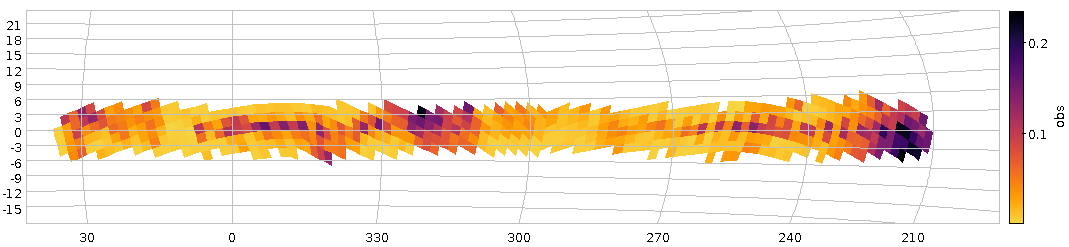
Fig 1: How our haphazard variability ratio varies over the sky (galactic coordinates). And yes, it's clear that this isn't dominated by physical variability.
About a year ago, I reported on a workshop on “Large Surveys with Small Telescopes” in Bamberg; at around the same time, I've published an example for those, the Bochum Galactic Disk Survey BGDS, which used a twin 15 cm robotic telescope in some no longer forsaken place in the Andes mountains to monitor the brighter stars in the southern Milky Way. While some tables from an early phase of the survey have been on VizieR for a while, we now publish the source images (also in SIAP and Obscore), the mean photometry (via SCS and TAP) and, perhaps potentially most fun of all, the the lightcurves (via SSAP and TAP) – a whopping 35 million of the latter.
This means that in tools like Aladin, you can now find such light curves (and images in two bands from a lot of epochs) when you are in the survey's coverage, and you can run TAP queries on GAVO's http://dc.g-vo.org/tap server against the full photometry table and the time series.
Regular readers of this blog will not be surprised to see me use this as an excuse to show off a bit of ADQL trickery.
If you have a look at the bgds.phot_all table in your favourite TAP client, you'll see that it has a column amp, giving the difference between the highest and lowest magnitude. The trouble is that amp for almost all objects just reflects the measurement error rather than any intrinsic variability. To get an idea what's “normal” (based on the fact that essentially all stars have essentially constant luminosity on the range and resolution scales considered here), run a query like:
SELECT ROUND(amp/err_mag*10)/10 AS bin, COUNT(*) AS n
FROM bgds.phot_all
WHERE nobs>10
GROUP BY bin
As this scans the entire 75 million rows of the table, you will probably have to use async mode to run this.
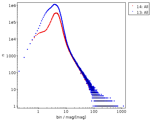
Figure 2: The distribution of amplitude over magnitude error for all BGDS objects with nobs>10 (blue) and the subset with a mean magnitude brighter than 15 (blue).
When it comes back, you will have, for objects where any sort of statistics make sense at all (hence nobs>10), a histogram (of sorts) of the amplitude in units of upstream's magnitude error estimation. If you log-log-plot this, you'll see something like Figure 2. The curve at least tells you that the magnitude error estimate is not very far off – the peak at about 3 “sigma” is not unreasonable since about half of the objects have nobs of the order of a hundred and thus would likely contain outliers that far out assuming roughly Gaussian errors.
And if you're doing a rough cutoff at amp/magerr>10, you will get perhaps not necessarily true variables, but, at least potentially interesting objects.
Let's use this insight to see if we spot any pattern in the distribution of these interesting objects. We'll use the HEALPix technique I've discussed three years ago in this blog, but with a little twist from ADQL 2.1: The Common Table Expressions or CTEs I have already mentioned in my blog post on ADQL 2.1 and then advertised in the piece on the Henry Draper catalogue. The brief idea, again, is that you can write queries and give their results a name that you can use elsewhere in the query as if it were an actual table. It's not much different from normal subqueries, but you can re-use CTEs in multiple places in the query (hence the “common”), and they are usually more readable.
Here, we first create a version of the photometry table that contains HEALPixes and our variability measure, use that to compute two unsophisticated per-HEALPix statistics and eventually join these two to our observable, the ratio of suspected variables to all stars observed (the multiplication with 1.0 is a cheap way to make a float out of a value, which is necessary here because a/b does integer division in ADQL if a and b are both integers):
WITH photpoints AS (
  SELECT
    amp/err_mag AS redamp,
    amp,
    ivo_healpix_index(5, ra, dec) AS hpx
  FROM bgds.phot_all
  WHERE
    nobs>10
    AND band_name='SDSS i'
    AND mean_mag<16),
all_objs AS (
  SELECT count(*) AS ct,
    hpx
    FROM photpoints GROUP BY hpx),
strong_var AS (
  SELECT COUNT(*) AS ct,
    hpx
    FROM photpoints
    WHERE redamp>4 AND amp>1 GROUP BY hpx)
SELECT
  strong_var.ct/(1.0*all_objs.ct) AS obs,
  all_objs.ct AS n,
  hpx
FROM strong_var JOIN all_objs USING (hpx)
WHERE all_objs.ct>20
If you plot this using TOPCAT's HEALPix thingy and ask it to use Galactic coordinates, you will end up with something like Figure 1.
There clearly is some structure, but given that the variables ratio reaches up to 0.2, this must be reflecting instrumental or pipeline effects and thus earthly rather than astrophysical causes. And that's going beyond what I wouldd like to talk about on a VO blog, although I'll take any bet that you will see significant structure in the spatial distribution of the variability ratio at about any magnitude cutoff, since there are a lot of different population mixtures in the survey's footprint.
Before winding down, let's have a quick look at the time series. As with the short spectra from Byurakan use case, we have stored the actual time series as arrays in the database (the mjd and mags columns in bgds.ssa_time_series). Unfortunately, since they are a lot less array-like than homogeneous spectra, it's also a lot harder to do interesting things with them without downloading them (I'm grateful for ideas for ADQL functions that will let you do in-DB analysis for such things). Still, you can at least easily download them in bulk and then process them in, say, python to your heart's content. The Byurakan use case should give you a head start there.
For a quick demo, I couldn't resist checking out objects that Simbad classifies as possible long-period variables (you see, as I write this, the public excitement over Betelgeuse's brief waning is just dying down), and so I queried Simbad for:
SELECT ra, dec, main_id
FROM basic
WHERE
  otype='LP?'
  AND 1=CONTAINS(
     POINT('', ra, dec),
     POLYGON('', 127, -30, 112, -30, 272, -30, 258, -30))
(as of this writing, Simbad still needs the ADQL 2.0-compliant first arguments to POINT and POLYGON), where the POLYGON is intended to give the survey's footprint. I obtained that by reading off the coordinates of the corners in my Figure 1 while it was still in TOPCAT. Oh, and I had to shrink it a bit because Simbad (well, the underlying Postgres server, and, more precisely, its pg_sphere extension) doesn't want polygons with edges longer than π. This will soon become less pedestrian: MOCs in relational databases are coming; more on this in a later post.
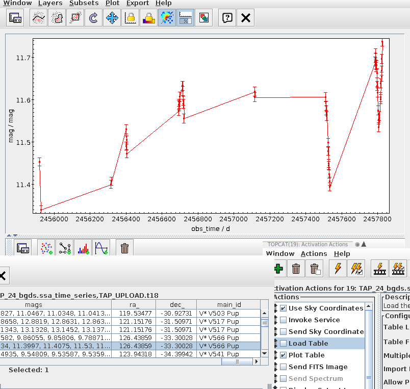
Fig 3: V566 Pup's BGDS lightcuve in a TOPCAT configured to auto-plot the light curves associated with a row from the bgds.ssa_time_series table on the GAVO DC TAP service.
If you now do the usual spiel with an upload crossmatch to the bgds.ssa_time_series table and check “Plot Table” in Views/Activation Action, you can quickly page through the light curves (TOPCAT will keep the plot style as you go from dataset to dataset, so it's worth configuring the lines and the error bars). Which could bring you to something like Fig. 3; and that would suggest that V* V566 Pup may be long-period (perhaps we are watching a slow maximium here), but on top of that there probably much faster ripples – unless the errors are grossly off; I am amazed that you can apparently do photometry at error levels of a dozen millimags or so from the ground these days.