Posts with the Tag HEALPix:

  • HEALPix Maps: In General and in Gaia

    blue and reddish pixels drawing a bar on the sky.

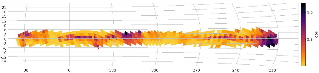
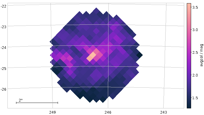
    A map of average Gaia colours in HEALPixes 2/83 and 2/86 (Orion south-east). This post tells you how to (relatively) quickly produce such maps.

    This year's puzzler for the AG Tagung turned out to be a valuable source of interesting ADQL queries. I have already written about finding dusty spots on the sky, and in the puzzler solution, I had promised some words on creating dust maps, or, more generally, HEALPix maps of any sort.

    Making HEALPix maps with Gaia source_ids

    The basic technique is explained in Mark Taylor's classical ADASS poster from 2016. On GAVO's TAP service (access URL http://dc.g-vo.org/tap), you will also find an example for that (in TOPCAT's TAP window, check the Service-provided section unter the Examples button for it). However, once you have Gaia source_ids, there is something a lot faster and arguably not much less convenient. Let me quote the footnote on source_id from my DR3 lite table:

    For the contents of Gaia DR3, the source ID consists of a 64-bit integer, least significant bit = 1 and most significant bit = 64, comprising:

    • a HEALPix index number (sky pixel) in bits 36 - 63; by definition the smallest HEALPix index number is zero.
    • […]

    This means that the HEALpix index level 12 of a given source is contained in the most significant bits. HEALpix index of 12 and lower levels can thus be retrieved as follows:

    • [...]
    • HEALpix [at] level n = (source_id)/(235⋅412 − n).

    That is: Once you have a Gaia source_id, you an compute HEALpix indexes on levels 12 or less by a simple integer division! I give you that the more-than-35-bit numbers you have to divide by do look a bit scary – but you can always come back here for cutting and pasting:

    HEALPix level Integer-divide source id by
    12 34359738368
    11 137438953472
    10 549755813888
    9 2199023255552
    8 8796093022208
    7 35184372088832
    6 140737488355328
    5 562949953421312
    4 2251799813685248
    3 9007199254740992
    2 36028797018963968

    If you know – and that is very valuable knowledge far beyond this particular application – that you can simply jump between HEALPix indexes of different levels by multiplying with or integer-dividing by four, the general formula in the footnote actually becomes rather memorisable. Let me illustrate that with an example in Python. HEALPix number 3145 on level 6 is:

    >>> 3145//4  # ...within this HEALPix on level 5...
    786
    >>> 3145*4, (3145+1)*4  # ..and covers these on level 7...
    (12580, 12584)
    

    Simple but ingenious.

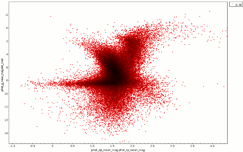
    You can immediately exploit this to make HEALPix maps like the one in the puzzler. This piece of ADQL does the job within a few seconds on the GAVO DC TAP service[1]:

    SELECT source_id/8796093022208 AS pix,
      AVG(phot_bp_mean_mag-phot_rp_mean_mag) AS avgcol
    FROM gaia.edr3lite
    WHERE distance(ra, dec, 246.7, -24.5)<2
    GROUP by pix
    

    Using the table above, you see that the horrendous 8796093022208 is the code for HEALPix level 8. When you remember (and you should) that HEALPix level 6 corresponds to a linear dimension of about 1 degree and each level is a factor of two in linear dimension, you see that the map ought to have a resolution of about 1/8th of a degree.

    HEALPix to Screen Pixel

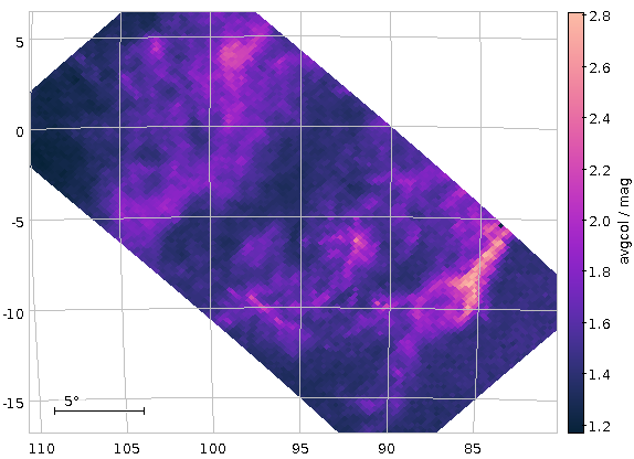
    How do you plot this? Well, in TOPCAT, do GraphicsSky Plot, and then in the plot window LayersAdd HEALPix control (there are icons for both of these, too). You then have to manually configure the plot for the table you just retrieved: Set the Level to 8, the index to pix and the Value to avgcol – we're working on making the annotation a bit richer so that TOPCAT has a chance to figure this out by itself.

    With a bit of extra configuration, you get the following map of average colours (really: dust concentration):

    Plot: Black and reddish pixels showing a bit of structure

    This is not totally ideal, as at the border of the cone, certain Healpixes are only partially covered, which makes statistics unnecessarily harder.

    Positional Constraints using source_ids

    Due to Gaia's brilliant numbering scheme, we can do analysis by HEALpix, too, circumventing (among other things) this problem. Say you are interested in the vicinity of the M42 and would like to investigate a patch of about 8 degrees. By our rule of thumb, 8 degrees is three levels up from the one-degree level 6. To find the corresponding HEALpix index, on DaCHS servers with their gavo_simbadpoint UDF you could say:

    SELECT TOP 1 ivo_healpix_index(3, gavo_simbadpoint('M42'))
    FROM tap_schema.tables
    

    Hu, you ask, what's tap_schema.tables to do with this? Well, nothing, really. It's just that ADQL's syntax requires selecting from a table, even if what we select is completely independent of any table, as for instance the index of M42's 3-HEALpix. The hack above picks in a table guaranteed to exist on all TAP services, and the TOP 1 makes sure we only compute the value once. In case you ever feel the need to abuse a TAP service as a calculator: Keep this trick in mind.

    The result, 334, you could also have found more graphically, as follows:

    1. Start Aladin
    2. Check OverlayHEALPix grid
    3. Enter M42 in Command
    4. Zoom out until you see HEALPix indexes of level 3 in the grid.

    An advantage you have with this method: You see that M42 happens to lie on a border of HEALPixes; perhaps you should include all of 334, 335, 356, and 357 if you were really interested in the Orion Nebula's vicinity.

    We, on the other hand, are just interested in instructive examples, and hence let's just repeat our colour mapping with all Gaia objects from HEALPix 3/334. How do you select these? Well, by source_id's construction, you know their source_ids will be between 334⋅9007199254740992 and (334 + 1)⋅9007199254740992 − 1:

    SELECT source_id/8796093022208 AS pix,
      AVG(phot_bp_mean_mag-phot_rp_mean_mag) AS avgcol
    FROM gaia.edr3lite
    WHERE source_id BETWEEN 334*9007199254740992 AND 335*9007199254740992-1
    GROUP by pix
    

    This is computationally cheap (though Postgres, not being a column store still has to do quite a bit of I/O; note how much faster this query is when you run it again and all the tuples are already in memory). Even going to HEALPix level 2 would in general still be within our sync time limit. The opening figure was produced with the constraint:

    source_id BETWEEN 83*36028797018963968 AND 84*36028797018963968-1
    OR source_id BETWEEN 86*36028797018963968 AND 87*36028797018963968-1
    

    – and with a sync query.

    Aggregating over a Non-HEALPix

    One last point: The constraints we have just been using are, in effect, positional constraints. You can also use them as quick and in some sense rather unbiased sampling tools.

    For instance, if you would like so see how the reddening in one of the “dense“ spots in the opening picture behaves with distance, you could first pick a point – α = 98, δ = 4, say –, then convert that to a level 7 healpix as above (that's/88974) and then write:

    SELECT ROUND(r_med_photogeo/200)*200 AS distbin, COUNT(*) as n,
        AVG(phot_bp_mean_mag-phot_rp_mean_mag) AS avgcol
    FROM gaia.dr3lite
    JOIN gedr3dist.main USING (source_id)
    WHERE source_id BETWEEN 88974*35184372088832 and 88975*35184372088832-1
    GROUP BY distbin
    

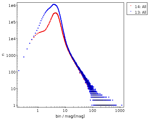
    This is creating 200 pc bins in distance based on the estimates in the gedr3dist.main table (note that this adds subtle correlations, because these estimates already contain Gaia colour information). Since quite a few of these bins will be very sparsely populated, I'm also fetching the number of objects contributing. And then I plot the whole thing, using the conventional (n) ⁄ n as a rough estimate for the relative error:

    Plot: A line that first slowly declines, then rises quite a bit, then flattens out and becomes crazy as errors start to dominate.

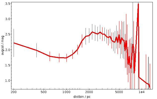
    This plot immediatly shows that colour systematics are not exclusively due to dust, as in that case things would only get redder all the time. The blueward trend up to 700 pc is reasonably well explained by the brighter, bluer upper main sequence becoming more dominant in the population sampled as red dwarfs become too faint for Gaia.

    The strong reddening setting in after that is rather certainly due to the Orion complex, though I would perhaps not have expected it to reach out to 2 kpc (the conventional distance to M42 is about 0.5 kpc); without having properly thought about it, I'll chalk it off as “the Orion arm“. And after that, it's again what I'd call Malmquist-blueing until the whole things dissolves into noise.

    In conclusion: Did you know you can group by both healpix and distbin at the same time? I am sure there are interesting structures to be found in what you will get from such a query…

    [1]You may be tempted to write source_id/(POWER(2, 35)*POWER(4, 3) here for clarity. Resist that temptation. POWER returns floating point numbers. If you have one float in a division, not even a ROUND will get you back into the integer division realm, and the whole trick implodes. No, you will need the integer literals for now.
  • Tangible Astronomy and Movies with TOPCAT

    This March, I've put up two new VO resources (that's jargon for “table or service or whatever”) that, I think, fit quite well what I like to call tangible astronomy: things you can readily relate to what you see when you step out at night. And, since I'm a professing astronomy nerd, that's always nicely gratifying.

    The two resources are the Constellations as Polygons and the Gaia eDR3 catalogue of nearby stars (GCNS).

    Constellations

    On the constellations, you might rightfully say that's really far from science. But then they do help getting an idea where something is, and when and from where you might see something. I've hence wanted for a long time to re-publish the Davenhall Constellation Boundary Data as proper, ADQL-queriable polygons, and figuring out where the loneliest star in the sky (and Voyager 1) were finally made me do it.

    GCNS density around taurus

    Taurus in the GCNS density plot: with constellations!

    So, since early March there's the cstl.geo table on the TAP service at https://dc.g-vo.org/tap with the constallation polygons in its p column. Which, for starters, means it's trivial to overplot constallation boundaries in your favourite VO clients now, as in the plot above. To make it, I've just done a boring SELECT * FROM cstl.geo, did the background (a plain HEALPix density plot of GCNS) and, clicked Layers → Add Area Control and selected the cstl.geo table.

    If you want to identify constellations by clicking, while in the area control, choose “add central” from the Forms menu in the Form tab; that's what I did in the figure above to ensure that what we're looking at here is the Hyades and hence Taurus. Admittedly: these “centres“ are – as in the catalogue – just the means of the vertices rather than the centres of mass of the polygon (which are hard to compute). Oh, and: there is also the AreaLabel in the Forms menu, for when you need the identification more than the table highlighting (be sure to use a center anchor here).

    Note that TOPCAT's polygon plot at this point is not really geared towards large polygons (which the constellations are) right now. At the time of writing, the documentation has: “Areas specified in this way are generally intended for displaying relatively small shapes such as instrument footprints. Larger areas may also be specified, but there may be issues with use.” That you'll see at the edges of the sky plots – but keeping that in mind I'd say this is a fun and potentially very useful feature.

    What's a bit worse: You cannot turn the constellation polygons into MOCs yet, because the MOC library currently running within our database will not touch non-convex polygons. We're working on getting that fixed.

    Nearby Stars

    Similarly tangible in my book is the GCNS: nearby stars I always find romantic.

    Let's look at the 100 nearest stars, and let's add spectral types from Henry Draper (cf. my post on Annie Cannon's catalogue) as well as the constellation name:

    WITH nearest AS (
    SELECT TOP 100
      a.source_id,
      a.ra, a.dec,
      phot_g_mean_mag,
      dist_50,
      spectral
    FROM gcns.main AS a
    LEFT OUTER JOIN hdgaia.main AS b
      ON (b.source_id_dr3=a.source_id)
    ORDER BY dist_50 ASC)
    SELECT nearest.*, name
    FROM nearest
    JOIN cstl.geo AS g
      ON (1=CONTAINS(
        POINT(nearest.ra, nearest.dec),
        p))
    

    Note how I'm using CONTAINS with the polygon in the constellations table here; that's the usage I've had in mind for this table (and it's particularly handy with table uploads).

    That I have a Common Table Expression (“WITH”) here is due to SQL planner confusion (I'll post something about that real soon now): With the WITH, the machine first selects the nearest 100 rows and then does the (relatively costly) spatial match, without it, the machine (somewhat surprisingly) did the geometric match first. This particular confusion looks fixable, but for now I'd ask you for forgiveness for the hack – and the technique is often useful anyway.

    If you inspect the result, you will notice that Proxima Cen is right there, but α Cen is missing; without having properly investigated matters, I'd say it's just too bright for the current Gaia data reduction (and quite possibly even for future Gaia analysis).

    Most of the objects on that list that have made it into the HD (i.e., have a spectral type here) are K dwarfs – which is an interesting conspiracy between the limits of the HD (the late red and old white dwarfs are too weak for it) and the limits of Gaia (the few earlier stars within 6 parsec – which includes such luminaries as Sirius at a bit more than 2.5 pc – are just too bright for where Gaia data reduction is now).

    Animation

    Another fairly tangible thing in the GCNS is the space velcity, given in km/s in the three dimensions U, V, and W. That is, of course, an invitation to look for stellar streams, as, within the relatively small portion of the Milky Way the GCNS looks at, stars on similar orbits will exhibit similar space motions.

    Considering the velocity dispersion within a stellar stream will be a few km/s, let's have the database bin the data. Even though this data is small enough to conveniently handle locally, this kind of remote analysis is half of what TAP is really great at (the other half being the ability to just jump right into a new dataset). You can group by multiple things at the same time:

    SELECT
      COUNT(*) AS n,
      ROUND(uvel_50/5)*5 AS ubin,
      ROUND(vvel_50/5)*5 AS vbin,
      ROUND(wvel_50/5)*5 AS wbin
    FROM gcns.main
    GROUP BY ubin, vbin, wbin
    

    Note that this (truly) 3D histogram only represents a small minority of the GCNS objects – you need radial velocities for space motion, and these are precious even in the Gaia age.

    What really surprised me is how clumpy this distribution is – are we sure we already know all stellar streams in the solar neighbourhood? Watch for yourself (if your browser can't play webm, complain to your vendor):

    [Update (2021-04-01): Mark Taylor points out that the “flashes” you sometimes see when the grid is aligned with the viewing axes (and the general appearance) could be improved by just pulling all non-NULL UVW values out of the table and using a density plot (perhaps shading=density densemap=inferno densefunc=linear). That is quite certainly true, but it would of course defeat the purpose of having on-server aggregation. Which, again, isn't all that critical for this dataset, so doing the prettier plot actually is a valuable exercise for the reader]

    How did I make this video? Well, I started with a Cube Plot in TOPCAT as usual, configuring weighted plotting with n as its weight and played around a bit with scaling out a few outliers. And then I saved the table (to zw.vot), hit “STILTS“ in the plot window and saved the text from there to a text file, zw.sh. I had to change the ``in`` clause in the script to make it look like this:

    #!/bin/sh
    stilts plot2cube \
     xpix=887 ypix=431 \
     xlabel='ubin / km/s' ylabel='vbin / km/s' \
     zlabel='wbin / km/s' \
     xmin=-184.5 xmax=49.5 ymin=-77.6 ymax=57.6 \
     zmin=-119.1 zmax=94.1 phi=-84.27 theta=90.35 \
      psi=-62.21 \
     auxmin=1 auxmax=53.6 \
     auxvisible=true auxlabel=n \
     legend=true \
     layer=Mark \
        in=zw.vot \
        x=ubin y=vbin z=wbin weight=n \
        shading=weighted size=2 color=blue
    

    – and presto, sh zw.sh would produce the plot I just had in TOPCAT. This makes a difference because now I can animate this.

    In his documentation, Mark already has a few hints on how to build animations; here are a few more ideas on how to organise this. For instance, if, as I want here, you want to animate more than one variable, stilts tloop may become a bit unwieldy. Here's how to give the camera angles in python:

    import sys
    from astropy import table
    import numpy
    
    angles = numpy.array(
      [float(a) for a in range(0, 360)])
    table.Table([
        angles,
        40+30*numpy.cos((angles+57)*numpy.pi/180)],
      names=("psi", "theta")).write(
        sys.stdout, format="votable")
    

    – the only thing to watch out for is that the names match the names of the arguments in stilts that you want to animate (and yes, the creation of angles will make numpy afficionados shudder – but I wasn't sure if I might want to have somewhat more complex logic there).

    [Update (2021-04-01): Mark Taylor points out that all that Python could simply be replaced with a straightforward piece of stilts using the new loop table scheme in stilts, where you would simply put:

    animate=:loop:0,360,0.5
    acmd='addcol phi $1'
    acmd='addcol theta 40+30*cosDeg($1+57)'
    

    into the plot2cube command line – and you wouldn't even need the shell pipeline.]

    What's left to do is basically the shell script that TOPCAT wrote for me above. In the script below I'm using a little convenience hack to let me quickly switch between screen output and file output: I'm defining a shell variable OUTPUT, and when I un-comment the second OUTPUT, stilts renders to the screen. The other changes versus what TOPCAT gave me are de-dented (and I've deleted the theta and psi parameters from the command line, as I'm now filling them from the little python script):

    OUTPUT="omode=out out=pre-movie.png"
    #OUTPUT=omode=swing
    
    python3 camera.py |\
    stilts plot2cube \
       xpix=500 ypix=500 \
       xlabel='ubin / km/s' ylabel='vbin / km/s' \
       zlabel='wbin / km/s' \
       xmin=-184.5 xmax=49.5 ymin=-77.6 ymax=57.6 \
       zmin=-119.1 zmax=94.1 \
       auxmin=1 auxmax=53.6 \
    phi=8 \
    animate=- \
    afmt=votable \
    $OUTPUT \
       layer=Mark \
          in=zw.vot \
          x=ubin y=vbin z=wbin weight=n \
          shading=weighted size=4 color=blue
    
    # render to movie with something like
    # ffmpeg -i "pre-movie-%03d.png" -framerate 15 -pix_fmt yuv420p /stream-movie.webm
    # (the yuv420p incantation is so real-world
    # web browsers properly will not go psychedelic
    # with the colours)
    

    The comment at the end says how to make a proper movie out of the PNGs this produces, using ffmpeg (packaged with every self-respecting distribution these days) and yielding a webm. Yes, going for mpeg x264 might be a lot faster for you as it's a lot more likely to have hardware support, but everything around mpeg is so patent-infested that for the sake of your first-born's soul you probably should steer clear of it.

    Movies are fun in webm, too.

  • The Bochum Galactic Disk Survey

    Patches of higher perceived variability on the Sky

    Fig 1: How our haphazard variability ratio varies over the sky (galactic coordinates). And yes, it's clear that this isn't dominated by physical variability.

    About a year ago, I reported on a workshop on “Large Surveys with Small Telescopes” in Bamberg; at around the same time, I've published an example for those, the Bochum Galactic Disk Survey BGDS, which used a twin 15 cm robotic telescope in some no longer forsaken place in the Andes mountains to monitor the brighter stars in the southern Milky Way. While some tables from an early phase of the survey have been on VizieR for a while, we now publish the source images (also in SIAP and Obscore), the mean photometry (via SCS and TAP) and, perhaps potentially most fun of all, the the lightcurves (via SSAP and TAP) – a whopping 35 million of the latter.

    This means that in tools like Aladin, you can now find such light curves (and images in two bands from a lot of epochs) when you are in the survey's coverage, and you can run TAP queries on GAVO's http://dc.g-vo.org/tap server against the full photometry table and the time series.

    Regular readers of this blog will not be surprised to see me use this as an excuse to show off a bit of ADQL trickery.

    If you have a look at the bgds.phot_all table in your favourite TAP client, you'll see that it has a column amp, giving the difference between the highest and lowest magnitude. The trouble is that amp for almost all objects just reflects the measurement error rather than any intrinsic variability. To get an idea what's “normal” (based on the fact that essentially all stars have essentially constant luminosity on the range and resolution scales considered here), run a query like:

    SELECT ROUND(amp/err_mag*10)/10 AS bin, COUNT(*) AS n
    FROM bgds.phot_all
    WHERE nobs>10
    GROUP BY bin
    

    As this scans the entire 75 million rows of the table, you will probably have to use async mode to run this.

    distribution of amplitude/mag errors

    Figure 2: The distribution of amplitude over magnitude error for all BGDS objects with nobs>10 (blue) and the subset with a mean magnitude brighter than 15 (blue).

    When it comes back, you will have, for objects where any sort of statistics make sense at all (hence nobs>10), a histogram (of sorts) of the amplitude in units of upstream's magnitude error estimation. If you log-log-plot this, you'll see something like Figure 2. The curve at least tells you that the magnitude error estimate is not very far off – the peak at about 3 “sigma” is not unreasonable since about half of the objects have nobs of the order of a hundred and thus would likely contain outliers that far out assuming roughly Gaussian errors.

    And if you're doing a rough cutoff at amp/magerr>10, you will get perhaps not necessarily true variables, but, at least potentially interesting objects.

    Let's use this insight to see if we spot any pattern in the distribution of these interesting objects. We'll use the HEALPix technique I've discussed three years ago in this blog, but with a little twist from ADQL 2.1: The Common Table Expressions or CTEs I have already mentioned in my blog post on ADQL 2.1 and then advertised in the piece on the Henry Draper catalogue. The brief idea, again, is that you can write queries and give them a name that you can use elsewhere in the query as if it were an actual table. It's not much different from normal subqueries, but you can re-use CTEs in multiple places in the query (hence the “common”), and it's usually more readable.

    Here, we first create a version of the photometry table that contains HEALPixes and our variability measure, use that to compute two unsophisticated per-HEALPix statistics and eventually join these two to our observable, the ratio of suspected variables to all stars observed (the multiplication with 1.0 is a cheap way to make a float out of a value, which is necessary here because a/b does integer division in ADQL if a and b are both integers):

    WITH photpoints AS (
      SELECT
        amp/err_mag AS redamp,
        amp,
        ivo_healpix_index(5, ra, dec) AS hpx
      FROM bgds.phot_all
      WHERE
        nobs>10
        AND band_name='SDSS i'
        AND mean_mag<16),
    all_objs AS (
      SELECT count(*) AS ct,
        hpx
        FROM photpoints GROUP BY hpx),
    strong_var AS (
      SELECT COUNT(*) AS ct,
        hpx
        FROM photpoints
        WHERE redamp>4 AND amp>1 GROUP BY hpx)
    SELECT
      strong_var.ct/(1.0*all_objs.ct) AS obs,
      all_objs.ct AS n,
      hpx
    FROM strong_var JOIN all_objs USING (hpx)
    WHERE all_objs.ct>20
    

    If you plot this using TOPCAT's HEALPix thingy and ask it to use Galactic coordinates, you'll end up with something like Figure 1.

    There clearly is some structure, but given that the variables ratio reaches up to 0.2, this is still reflecting instrumental or pipeline effects and thus earthly rather than Astrophysics. And that's going beyond what I'd like to talk about on a VO blog, although I'l take any bet that you will see significant structure in the spatial distribution of the variability ratio at about any magnitude cutoff, since there are a lot of different population mixtures in the survey's footprint.

    Be that as it may, let's have a quick look at the time series. As with the short spectra from Byurakan use case, we've stored the actual time series as arrays in the database (the mjd and mags columns in bgds.ssa_time_series. Unfortunately, since they are a lot less array-like than homogeneous spectra, it's also a lot harder to do interesting things with them without downloading them (I'm grateful for ideas for ADQL functions that will let you do in-DB analysis for such things). Still, you can at least easily download them in bulk and then process them in, say, python to your heart's content. The Byurakan use case should give you a head start there.

    For a quick demo, I couldn't resist checking out objects that Simbad classifies as possible long-period variables (you see, as I write this, the public bohei over Betelgeuse's brief waning is just dying down), and so I queried Simbad for:

    SELECT ra, dec, main_id
    FROM basic
    WHERE
      otype='LP?'
      AND 1=CONTAINS(
         POINT('', ra, dec),
         POLYGON('', 127, -30, 112, -30, 272, -30, 258, -30))
    

    (as of this writing, Simbad still needs the ADQL 2.0-compliant first arguments to POINT and POLYGON), where the POLYGON is intended to give the survey's footprint. I obtained that by reading off the coordinates of the corners in my Figure 1 while it was still in TOPCAT. Oh, and I had to shrink it a bit because Simbad (well, the underlying Postgres server, and, more precisely, its pg_sphere extension) doesn't want polygons with edges longer than π. This will soon become less pedestrian: MOCs in relational databases are coming; more on this soon.

    TOPCAT action shot with a light curve display

    Fig 3: V566 Pup's BGDS lightcuve in a TOPCAT configured to auto-plot the light curves associated with a row from the bgds.ssa_time_series table on the GAVO DC TAP service.

    If you now do the usual spiel with an upload crossmatch to the bgds.ssa_time_series table and check “Plot Table” in Views/Activation Action, you can quickly page through the light curves (TOPCAT will keep the plot style as you go from dataset to dataset, so it's worth configuring the lines and the error bars). Which could bring you to something like Fig. 3; and that would suggest that V* V566 Pup isn't really long-period unless the errors are grossly off.

  • Deredden using TAP

    An animated color-magnitude diagram

    Raw and dereddened CMD for a region in Cygnus.

    Today I published a nice new set of tables on our TAP service: The Bayestar17 3D dust map derived from Pan-STARRS 1 by Greg Green et al. I mention in passing that this was made particularly enjoyable because Greg and friends put an explicit license on their data (in this case, CC-BY-SA).

    This dust map is probably a fascinating resource by itself, but the really nifty thing is that you can use it to correct all kinds of photometric data for extinction – at least to some extent. On the Bayestar web page, the authors give some examples for usage – and with our new service, you can use TAP as well to correct photometry for extinction.

    To see how, first have a look at the table metadata for the prdust.map_union table; this is what casual users probably should look at. More specifically, at the coverage, best_fit, and grdiagnostic columns.

    coverage here is an interval of 10-healpixes. It has to be an interval because the orginal data comes on wildly different levels; depending on the density of stars, sometimes it takes the area of a 6-healpix (about a square degree) to get enough signal, whereas in the galactic plane a 10-healpix (a thousandth of a square degree) already has enough stars. To make the whole thing conveniently queriable without exploding a 6-healpix row into 1000 identical rows, larger healpixes translate into intervals of 10-helpixes. Don't panic, though, I'll show how to conveniently query this below.

    best_fit and grdiagnostic are arrays (remember the light cuves in Gaia DR2?). In bins of 0.5 in distance modulus (which is, in case you feel a bit uncertain as to the algebraic signs, 5 log10(dist)-5 for a distance in parsec), starting with a distance modulus of 4 and ending with 19. This means that for a distance modulus of 4.2 you should check the array index 0, whereas 4.3 already would be covered by array index 1. With this, best_fit[ind] gives E(B-V) = (B-V) - (B-V)0 in the direction of coverage in a distance modulus bin of 2*ind+4. For each best_fit[ind], grdiagnostic[ind] contains a quality measure for that value. You probably shouldn't touch the E(B-V) if that measure is larger than 1.2.

    So, how does one use this?

    To try things, let's pull some Gaia data with distances; in order to have interesting extinctions, I'm using a patch in Cygnus (RA 288.5, Dec 2.3). If you live on the northern hemisphere and step out tonight, you could see dust clouds there with the naked eye (provided electricity fails all around, that is). Full disclosure: I tried the Coal Sack first but after checking the coverage of the dataset – which essentially is the sky north of -30 degrees – I noticed that wouldn't fly. But stories like these are one reason why I'm making such a fuss about having standard STC coverage representations.

    We want distances, and to dodge all the intricacies involved when naively turning parallaxes to distances discussed at length in a paper by Xavier Luri et al (and elsewhere), I'm using precomputed distances from Bailer-Jones et al. (2018AJ....156...58B); you'll find them on the "ARI Gaia" service; in TOPCAT's TAP dialog simply search for “Gaia” – that'll give you the GAVO DC TAP search, too, and that we'll need in a second.

    The pre-computed distances are in the gaiadr2_complements.geometric_distance table, which can be joined to the main Gaia object catalog using the source_id column. So, here's a query to produce a little photometric catalog around our spot in Cygnus (we're discarding objects with excessive parallax errors while we're at it):

    SELECT
    r_est, 5*log10(r_est)-5 as dist_mod,
    phot_g_mean_mag, phot_bp_mean_mag, phot_rp_mean_mag,
    ra, dec
    FROM
    gaiadr2.gaia_source
    JOIN gaiadr2_complements.geometric_distance
    USING (source_id)
    WHERE
    parallax_over_error>1
    AND 1=CONTAINS(POINT('ICRS', ra, dec), CIRCLE('ICRS', 288.5, 2.3, 0.5 ))
    

    The color-magnitude diagram resulting from this is the red point cloud in the animated GIF at the top. To reproduce it, just plot phot_bp_mean_mag-phot_rp_mean_mag against phot_g_mean_mag-dist_mod (and invert the y axis).

    De-reddening this needs a few minor technicalities. The most important one is how to match against the odd intervals of healpixes in the prdust.map_union table. A secondary one is that we have only pulled equatorial coordinates, and the healpixes in prdust are in galactic coordinates.

    Computing the healpix requires the ivo_healpix_index ADQL user defined function (UDF) that you may have met before, and since we have to go from ICRS to Galactic it requires a fairly new UDF I've recently defined to finally get the discussion on having a “standard library” of astrometric functions in ADQL going: gavo_transform. Here's how to get a 10-healpix as required for map_union from ra and dec:

    CAST(ivo_healpix_index(10,
      gavo_transform('ICRS', 'GALACTIC', POINT(ra, dec))) AS INTEGER)
    

    The CAST call is a pure technicality – ivo_healpix_index returns a 64-bit integer, which I can't use in my interval logic.

    The comparison against the intervals you could do yourself, but as argued in Registry-STC article this is one of the trivial things that are easy to get wrong. So, let's use the ivo_interval_overlaps UDF; it goes in the join condition to properly match prdust healpixes to catalog positions. Then our total query – that, I hope, should be reasonably easy to adapt to similar problems – is:

    WITH sources AS (
      SELECT phot_g_mean_mag,
        phot_bp_mean_mag,
        phot_rp_mean_mag,
        dist_mod,
        CAST(ivo_healpix_index(10,
          gavo_transform('ICRS', 'GALACTIC', POINT(ra, dec))) AS INTEGER) AS hpx,
        ROUND((dist_mod-4)*2)+1 AS dist_mod_bin
      FROM TAP_UPLOAD.T1)
    
    SELECT
      phot_bp_mean_mag-phot_rp_mean_mag-dust.best_fit[dist_mod_bin] AS color,
      phot_g_mean_mag-dist_mod+
        dust.best_fit[dist_mod_bin]*3.384 AS abs_mag,
      dust.grdiagnostic[dist_mod_bin] as qual
    FROM sources
    JOIN prdust.map_union AS dust
    ON (1=ivo_interval_has(hpx, coverage))
    

    (If you're following along: you have to switch to the GAVO DC TAP to run this, and you will probably have to change the index after TAP_UPLOAD).

    Ok, in the photometry department there's a bit of cheating going on here – I'm correcting Gaia B-R with B-V, and I'm using the factor for Johnson V to estimate the extinction in Gaia G (if you're curious where that comes from: See the footnote on best_fit and the MC extinction service docs should get you started), so this is far from physically correct. But, as you can see from the green cloud in the plot above, it already helps a bit. And if you find out better factors, by all means let me know so I can add an update... right here:

    Update (2018-09-11): The original data creator, Gregory Green points out that the thing with having a better factor for Gaia G isn't that simple, because, as he says “Gaia G is very broad, [and] the extinction coefficients are much more dependent on stellar type, and extinction is also more nonlinear with dust column (extinction is only linear with dust column and independent of stellar type for an infinitely narrow passband)”. So – when de-reddening, prefer narrow passbands. But whether narrow or wide: TAP helps you.

Page 1 / 1