![[RSS]](./theme/image/rss.png)
This March, I've put up two new VO resources (that's jargon for “table or service or whatever”) that, I think, fit quite well what I like to call tangible astronomy: things you can readily relate to what you see when you step out at night. And, since I'm a professing astronomy nerd, that's always nicely gratifying.
The two resources are the Constellations as Polygons and the Gaia eDR3 catalogue of nearby stars (GCNS).
Constellations
On the constellations, you might rightfully say that's really far from science. But then they do help getting an idea where something is, and when and from where you might see something. I've hence wanted for a long time to re-publish the Davenhall Constellation Boundary Data as proper, ADQL-queriable polygons, and figuring out where the loneliest star in the sky (and Voyager 1) were finally made me do it.
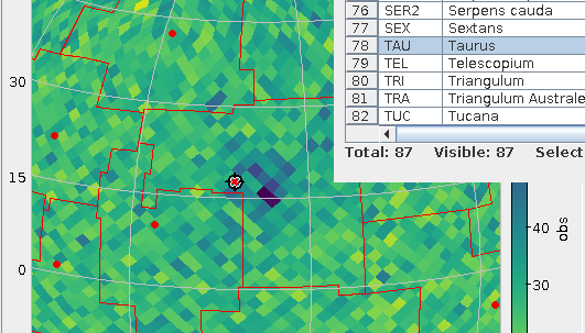
Taurus in the GCNS density plot: with constellations!
So, since early March there's the cstl.geo table on the TAP service at https://dc.g-vo.org/tap with the constallation polygons in its p column. Which, for starters, means it's trivial to overplot constallation boundaries in your favourite VO clients now, as in the plot above. To make it, I've just done a boring SELECT * FROM cstl.geo, did the background (a plain HEALPix density plot of GCNS) and, clicked Layers → Add Area Control and selected the cstl.geo table.
If you want to identify constellations by clicking, while in the area control, choose “add central” from the Forms menu in the Form tab; that's what I did in the figure above to ensure that what we're looking at here is the Hyades and hence Taurus. Admittedly: these “centres“ are – as in the catalogue – just the means of the vertices rather than the centres of mass of the polygon (which are hard to compute). Oh, and: there is also the AreaLabel in the Forms menu, for when you need the identification more than the table highlighting (be sure to use a center anchor here).
Note that TOPCAT's polygon plot at this point is not really geared towards large polygons (which the constellations are) right now. At the time of writing, the documentation has: “Areas specified in this way are generally intended for displaying relatively small shapes such as instrument footprints. Larger areas may also be specified, but there may be issues with use.” That you'll see at the edges of the sky plots – but keeping that in mind I'd say this is a fun and potentially very useful feature.
What's a bit worse: You cannot turn the constellation polygons into MOCs yet, because the MOC library currently running within our database will not touch non-convex polygons. We're working on getting that fixed.
Nearby Stars
Similarly tangible in my book is the GCNS: nearby stars I always find romantic.
Let's look at the 100 nearest stars, and let's add spectral types from Henry Draper (cf. my post on Annie Cannon's catalogue) as well as the constellation name:
WITH nearest AS (
SELECT TOP 100
  a.source_id,
  a.ra, a.dec,
  phot_g_mean_mag,
  dist_50,
  spectral
FROM gcns.main AS a
LEFT OUTER JOIN hdgaia.main AS b
  ON (b.source_id_dr3=a.source_id)
ORDER BY dist_50 ASC)
SELECT nearest.*, name
FROM nearest
JOIN cstl.geo AS g
  ON (1=CONTAINS(
    POINT(nearest.ra, nearest.dec),
    p))
Note how I'm using CONTAINS with the polygon in the constellations table here; that's the usage I've had in mind for this table (and it's particularly handy with table uploads).
That I have a Common Table Expression (“WITH”) here is due to SQL planner confusion (I'll post something about that real soon now): With the WITH, the machine first selects the nearest 100 rows and then does the (relatively costly) spatial match, without it, the machine (somewhat surprisingly) did the geometric match first. This particular confusion looks fixable, but for now I'd ask you for forgiveness for the hack – and the technique is often useful anyway.
If you inspect the result, you will notice that Proxima Cen is right there, but α Cen is missing; without having properly investigated matters, I'd say it's just too bright for the current Gaia data reduction (and quite possibly even for future Gaia analysis).
Most of the objects on that list that have made it into the HD (i.e., have a spectral type here) are K dwarfs – which is an interesting conspiracy between the limits of the HD (the late red and old white dwarfs are too weak for it) and the limits of Gaia (the few earlier stars within 6 parsec – which includes such luminaries as Sirius at a bit more than 2.5 pc – are just too bright for where Gaia data reduction is now).
Animation
Another fairly tangible thing in the GCNS is the space velcity, given in km/s in the three dimensions U, V, and W. That is, of course, an invitation to look for stellar streams, as, within the relatively small portion of the Milky Way the GCNS looks at, stars on similar orbits will exhibit similar space motions.
Considering the velocity dispersion within a stellar stream will be a few km/s, let's have the database bin the data. Even though this data is small enough to conveniently handle locally, this kind of remote analysis is half of what TAP is really great at (the other half being the ability to just jump right into a new dataset). You can group by multiple things at the same time:
SELECT
  COUNT(*) AS n,
  ROUND(uvel_50/5)*5 AS ubin,
  ROUND(vvel_50/5)*5 AS vbin,
  ROUND(wvel_50/5)*5 AS wbin
FROM gcns.main
GROUP BY ubin, vbin, wbin
Note that this (truly) 3D histogram only represents a small minority of the GCNS objects – you need radial velocities for space motion, and these are precious even in the Gaia age.
What really surprised me is how clumpy this distribution is – are we sure we already know all stellar streams in the solar neighbourhood? Watch for yourself (if your browser can't play webm, complain to your vendor):
[Update (2021-04-01): Mark Taylor points out that the “flashes” you sometimes see when the grid is aligned with the viewing axes (and the general appearance) could be improved by just pulling all non-NULL UVW values out of the table and using a density plot (perhaps shading=density densemap=inferno densefunc=linear). That is quite certainly true, but it would of course defeat the purpose of having on-server aggregation. Which, again, isn't all that critical for this dataset, so doing the prettier plot actually is a valuable exercise for the reader]
How did I make this video? Well, I started with a Cube Plot in TOPCAT as usual, configuring weighted plotting with n as its weight and played around a bit with scaling out a few outliers. And then I saved the table (to zw.vot), hit “STILTS“ in the plot window and saved the text from there to a text file, zw.sh. I had to change the ``in`` clause in the script to make it look like this:
#!/bin/sh
stilts plot2cube \
 xpix=887 ypix=431 \
 xlabel='ubin / km/s' ylabel='vbin / km/s' \
 zlabel='wbin / km/s' \
 xmin=-184.5 xmax=49.5 ymin=-77.6 ymax=57.6 \
 zmin=-119.1 zmax=94.1 phi=-84.27 theta=90.35 \
  psi=-62.21 \
 auxmin=1 auxmax=53.6 \
 auxvisible=true auxlabel=n \
 legend=true \
 layer=Mark \
    in=zw.vot \
    x=ubin y=vbin z=wbin weight=n \
    shading=weighted size=2 color=blue
– and presto, sh zw.sh would produce the plot I just had in TOPCAT. This makes a difference because now I can animate this.
In his documentation, Mark already has a few hints on how to build animations; here are a few more ideas on how to organise this. For instance, if, as I want here, you want to animate more than one variable, stilts tloop may become a bit unwieldy. Here's how to give the camera angles in python:
import sys
from astropy import table
import numpy

angles = numpy.array(
  [float(a) for a in range(0, 360)])
table.Table([
    angles,
    40+30*numpy.cos((angles+57)*numpy.pi/180)],
  names=("psi", "theta")).write(
    sys.stdout, format="votable")
– the only thing to watch out for is that the names match the names of the arguments in stilts that you want to animate (and yes, the creation of angles will make numpy afficionados shudder – but I wasn't sure if I might want to have somewhat more complex logic there).
[Update (2021-04-01): Mark Taylor points out that all that Python could simply be replaced with a straightforward piece of stilts using the new loop table scheme in stilts, where you would simply put:
animate=:loop:0,360,0.5
acmd='addcol phi $1'
acmd='addcol theta 40+30*cosDeg($1+57)'
into the plot2cube command line – and you wouldn't even need the shell pipeline.]
What's left to do is basically the shell script that TOPCAT wrote for me above. In the script below I'm using a little convenience hack to let me quickly switch between screen output and file output: I'm defining a shell variable OUTPUT, and when I un-comment the second OUTPUT, stilts renders to the screen. The other changes versus what TOPCAT gave me are de-dented (and I've deleted the theta and psi parameters from the command line, as I'm now filling them from the little python script):
OUTPUT="omode=out out=pre-movie.png"
#OUTPUT=omode=swing

python3 camera.py |\
stilts plot2cube \
   xpix=500 ypix=500 \
   xlabel='ubin / km/s' ylabel='vbin / km/s' \
   zlabel='wbin / km/s' \
   xmin=-184.5 xmax=49.5 ymin=-77.6 ymax=57.6 \
   zmin=-119.1 zmax=94.1 \
   auxmin=1 auxmax=53.6 \
phi=8 \
animate=- \
afmt=votable \
$OUTPUT \
   layer=Mark \
      in=zw.vot \
      x=ubin y=vbin z=wbin weight=n \
      shading=weighted size=4 color=blue

# render to movie with something like
# ffmpeg -i "pre-movie-%03d.png" -framerate 15 -pix_fmt yuv420p /stream-movie.webm
# (the yuv420p incantation is so real-world
# web browsers properly will not go psychedelic
# with the colours)
The comment at the end says how to make a proper movie out of the PNGs this produces, using ffmpeg (packaged with every self-respecting distribution these days) and yielding a webm. Yes, going for mpeg x264 might be a lot faster for you as it's a lot more likely to have hardware support, but everything around mpeg is so patent-infested that for the sake of your first-born's soul you probably should steer clear of it.
Movies are fun in webm, too.