Query the Registry with WIRR

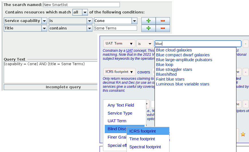
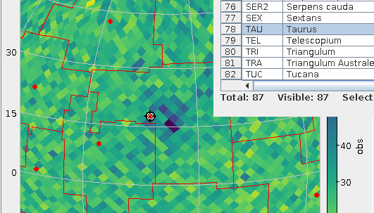
Pixels from venerable VODesktop and WIRR: it's supposed to be about the same thing, except WIRR uses and exposes the latest Registry standards (and then some tech that's not standard yet).
When the VO was young, there was a programme called VODesktop that had a very nice interface for searching the Registry. Also, it would run queries against the services discovered, giving nice all-VO querying that few modern clients do quite as elegantly. Regrettably, when the astrogrid UK project was de-funded, VODesktop's development ceased in 2010.
In 2012, it had become clear that nobody would step up to continue it, and I wanted to at least provide a replacement for the Registry interface part. In consequence, Florian Rothmaier and I wrote the Web Interface to the Relational Registry, or WIRR for short; this lets you build Registry queries in your Web Browser in an interface inspired by VODesktop (which, I'm told, in turn was inspired by early iTunes).
WIRR's sweet spot is between the Registry interfaces in the usual clients (TOPCAT, Aladin: these try to hide the gory details of where their service lists come from and hence are limited in what interaction they allow) and using a TAP client to write and execute RegTAP queries (where there are no limitations beyond the protocol's, but it's tedious unless you happen to know the RegTAP standard by heart).
In contrast to its model VODesktop, WIRR cannot run any queries against the services discovered using it. But you can transfer the services you have found to clients via SAMP (TOPCAT can handle the relevant MTypes, but I'm frankly not sure what else). Apart from that, an obvious use for WIRR are the queries one needs in VO curation. For instance, I keep linking to it when sending people canned registry queries, as in the section on claiming an authority in the DaCHS Tutorial.
Given that both Javascript and the Registry have evolved a lot in the past decade, WIRR was in need of a major redecoration for some time now, and in early July, I found some time to do it. The central result is that the code is now halfway modern, strict Javascript; let's see how many web browsers still run that can't execute this.
On the surface, much less has changed, but there are some news I'd consider noteworthy and that might help your data discovery-fu:
- Since I've added some constraint types, the constraint type selector is now a hierarchical box, sporting what I think are or should be the most common constraint types (full text, service type and UAT term) on level 0 and then having “Blind Discovery“, “Finer Grained“, and “Special Effects“ as pop-ups; all this so we obey Miller's Rule of Seven.
- Rather than explain the constraints on a second, separate page, there are now brief help texts coming with each constaint.
- You can now match against UAT concepts, and there is a completing input box for them; in case you're wondering what this is about, see this post from last February. And yes, next time I'll play with WIRR I'll probably include SemBaReBro here.
- When constraining by column UCD, you can now choose from UCDs found in the registry (the “Pick one“ button).
- You can now constrain by spatial, temporal, and spectral coverage, though that's still a gamble because not many (or, actually, very few in the case of temporal and spectral) operators care to declare their services' coverage. When they don't, you won't see their resources with such blind discovery constraints. For some background on this, check Space and Time not lost on the Registry on this blog.
- There is now a „SQL“ button with successful searches that lets you retrieve the SQL executed for the particular constraint. While that query does not immediately execute on RegTAP services (it's Postgres' SQL rather than ADQL), it ought to give you a head start when transplanting your Registry query into, say, a pyVO-based script.
- You can now use your browser's back and forward buttons (or, in my case. key bindings) to navigate in your query history.
What this still doesn't do: Work without Javascript. That's a bit of a disgrace, since after the last changes it would actually be reasonable to provide non-javascript fallbacks for some of the basic functionality (of course, no SAMP at all then…). I'll do it the first time someone asks. Promised.
A document that now needs at least slight updates because things have moved about a bit is the data discovery use case Florian wrote back then. The updates absolutely necessary are not terribly involved, but I would like to use the opportunity to add a bit more spice to the tutorial. If you have ideas: I'm all ears.
Oh, and before I close: you can still run VODesktop; kudos to the maintainers of the JVM for that. But it's nevertheless not really usable any more, which perhaps isn't too surprising for a client built on top of experimental online services ten years ago. For one, its TAP client speaks pre-release versions of both TAP and ADQL, so those won't work on modern TAP services (and the ancient ones have vanished). Worse, it needed to use a non-standard extension of RegTAP's predecessor (for those old enough to remember: it used XQuery), and none of the modern searchable registries understands that any more.
Which is a pity, really. It's been a fine programme. It just was a few years early: By 2012, everything it needed has been defined in nice, stable standards that are still around and probably will be for another decade at least.

![[RSS]](./theme/image/rss.png)


